
Enhance account security with real-time ID check
Achieved a 98% overall completion rate, with 76% completing under 6 seconds through user testing and iteration
Lalamove
Lalamove is an on-demand delivery platform that connects 13 million users with 1.2 million driver partners in 11 markets across the world. Lalamove driver-partner app is a tool for drivers to receive and manage delivery requests from customers.
ROLE
As a product designer, for 4 weeks, I was responsible for:
• Gathering requirements from the fraud team in collaboration with 2 product managers
• Designing user interfaces and interactions for the real-time ID check
• Ensuring feasibility and consistency with the existing user experience, consulting with engineers and data scientists
• Handing over detailed flows and design specs via Figma and prototypes via Protopie
• Contributing to a PRD by providing the interactions and conditions for the solution
Real-time ID check enhances driver account security and ensures usability
Submission completion rate
97.5%
Completion rate under 6 secs
75.7%
CHALLENGE
Drivers need more protection in their accounts.
Current security measures for drivers' accounts are inadequate, risking unauthorized access and fraud. This can lead to financial losses and erode customer trust in Lalamove if the drivers differ from the app's photos. While added security may add friction to logging in, facial recognition is a standard practice that can verify identities, reduce account takeover risks, and enhance protection for drivers.
The problem statement is:
How can we help drivers protect their accounts and reduce the risk of account takeover without unnecessary friction through facial recognition?
PRODUCT REQUIREMENT
MVP focused on data collection of the ID check before imposing penalty.
The product manager and I collaborated with our fraud team to implement the facial recognition feature.
1 - Entry point
We ask drivers to do a facial ID check when they log in because identification fraud is mostly likely to happen when drivers log in.
2 - Process
We use two approaches based on the level of desired security.
Static - Easy
Drivers simply need to take a photo of their faces.
Gesture - Secure
Drivers follow a gesture guide to verify the authenticity of their faces.
3 - Result
To gradually introduce drivers to the real-time ID check results, we have planned two phases.
Phase 1: (This stage)
Data collection & no penalty
Phase 2
Live verification & penalty
SUCCESS METRICS
At this stage, target 100% completion rate while minimizing the completion time
The product manager and I set measurable goals to determine if the feature is on the right track and achieves the desirable outcome.
This stage
• Target nearly 100% completion rate
Future stage
• Reduce the number of fraudulent incidents of driver account
• Increase user satisfaction and trust in the platform
PRINCIPLES
The goal is to ensure drivers understand clearly and complete instantly so that drivers can start delivering without frustration.
I set design principles based on user needs and business needs to guide solutions.

Ease and speed
Solution prioritizes driver safety with a focus on ease and speed of use in case drivers are driving.

External & internal consistency
Solution ensures optimal learnability for drivers to complete the ID check.
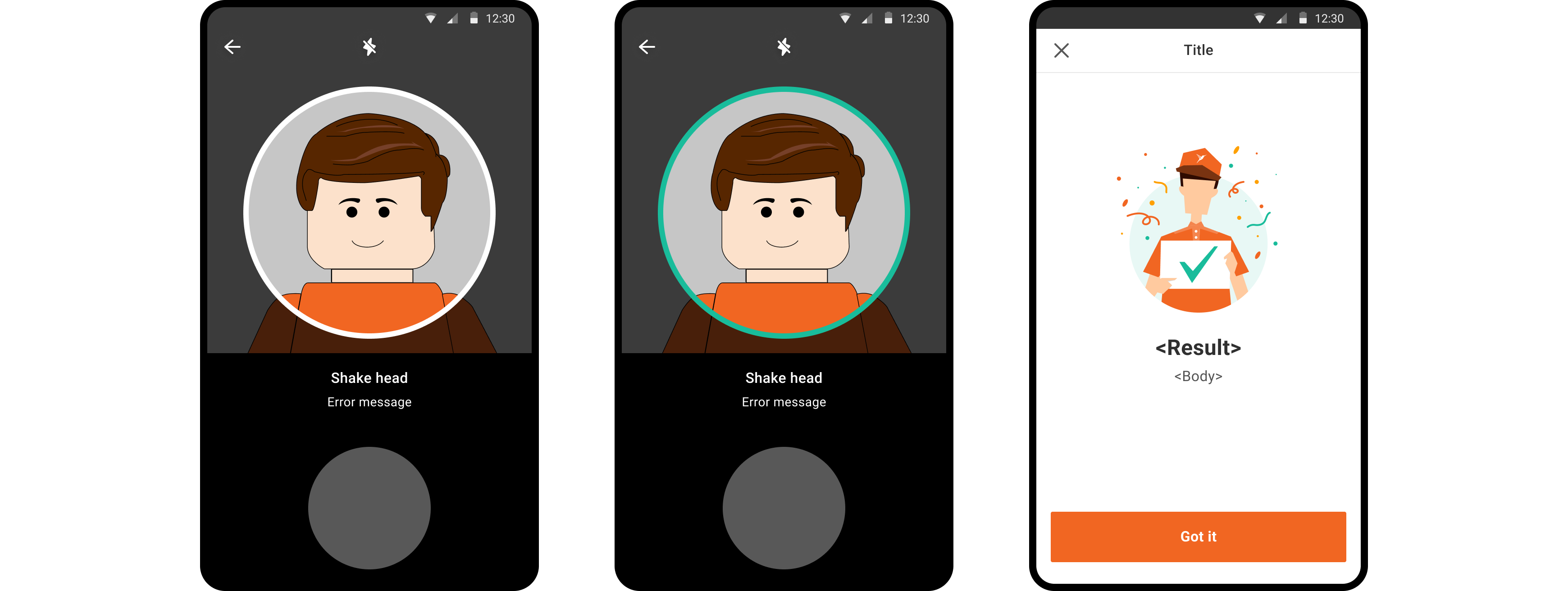
Guide to complete ID check
Provide clear instructions to help drivers complete accurately
Instructions with animation and error messages are simple and easy to notice in order for drivers to minimize completion time and ensure their safety in case they are driving while completing the ID check.
Clear navigation to help drivers complete without frustration
The design aligns with the competitor apps that over 50% of drivers have used. This familiarity allows users to quickly understand and navigate without confusion. Incorporating a progress indicator manages user expectations by providing clarity on the task duration, promoting efficient completion of the feature.
Design Execution
Examine other apps to ensure a learnable user experience
Since over 50% of the drivers in the testing market already use competitors' apps, designing it to be consistent with those competitors will make the feature more learnable.
Usability Heuristics #4 Consistency and Standards
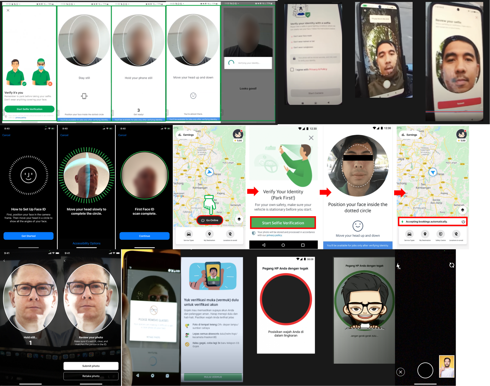
The common pattern from those screenshots would be these 4 screens.
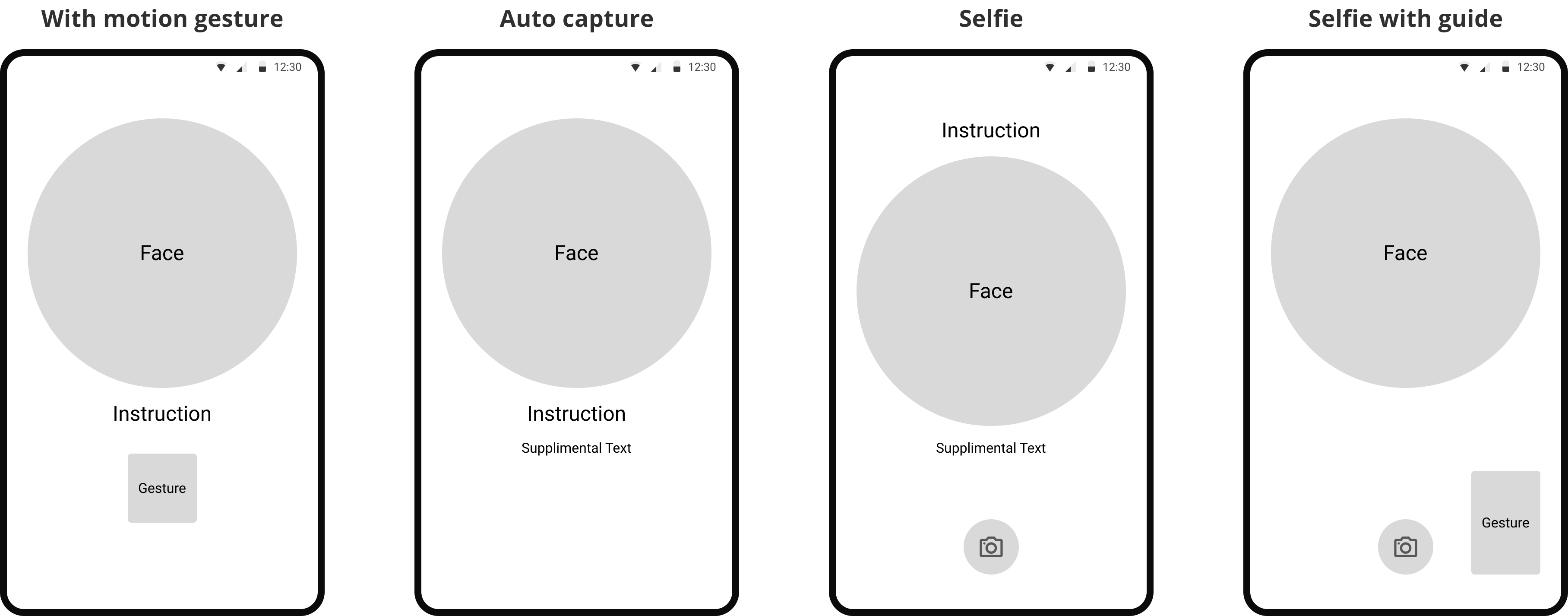
Design ideas to translate the common patterns into the solution
Based on the references above, I narrowed down a few ideas to present to stakeholders.
Idea 1 - Capturing animation
 Enhance focus on capturing the face frame
 Challenging to implement
Only texts lack clarity in guiding drivers
Idea 2 - Guidance at the top
✅ Help drivers focus on the guide by putting at the top
❌ Distracting with scattered elements across various positions
❌ Hinder navigation with frequent eye shifts from top to bottom
 Winner
Idea 3 - Guidance and instruction at the bottom
Enhance learnability as the most prevalent pattern
Enhance the clarity in guiding drivers with animation
Lack the movement to guide drivers
We chose the idea 3 to proceed to testing
Idea 3 could be most navigable due to its learnability as the most commonly observed pattern. By organizing information into groups, it becomes easier to digest. Moreover, this approach requires minimal animation, reducing the tech effort.
Test the idea to understand the placement of the instruction
I was uncertain about the placement of the instructions - above or below the facial recognition frame. I asked some colleagues to interact with a quick prototype, which allowed me to observe how users interact with the layout and determine the most intuitive placement for instructions.
I created a basic prototype by printing out the design and attached it to an actual mobile device.
The feedback was divisive.
People were divided between them as each preferred either for different reasons.

Some prefer to read instructions at the top, as it provides a more natural flow.
Some prefer to see the text and image together to know what to do.
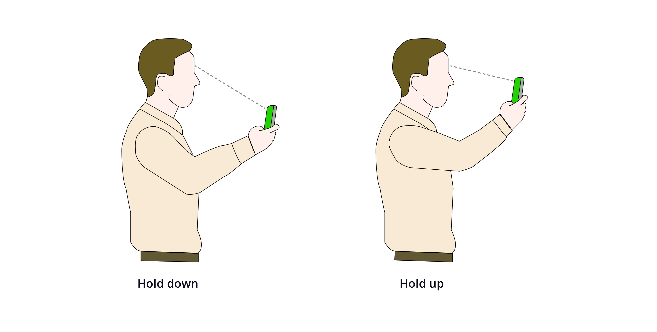
The frame position being in the middle is preferred, as some people like to look down at their phone for recurring tasks.
This frame position is easier to adjust the view with this frame position if the camera is held higher.
The frame should be positioned high.
While the preference was divided, I discovered that the participants who preferred the camera frame to be higher held up their phones. In our previous research, many drivers mounted their phones near windshields. Also, users often hold up phones for facial recognition in YouTube videos.
Need to use a high-quality prototype to truly understand how usable the design is.
At the end, I couldn’t figure out the instruction placement, which was the intent of the testing. I learned that a simple, low-quality prototype isn't enough to fully test a design, and I couldn't decide whether the instruction should be above or below the camera frame.
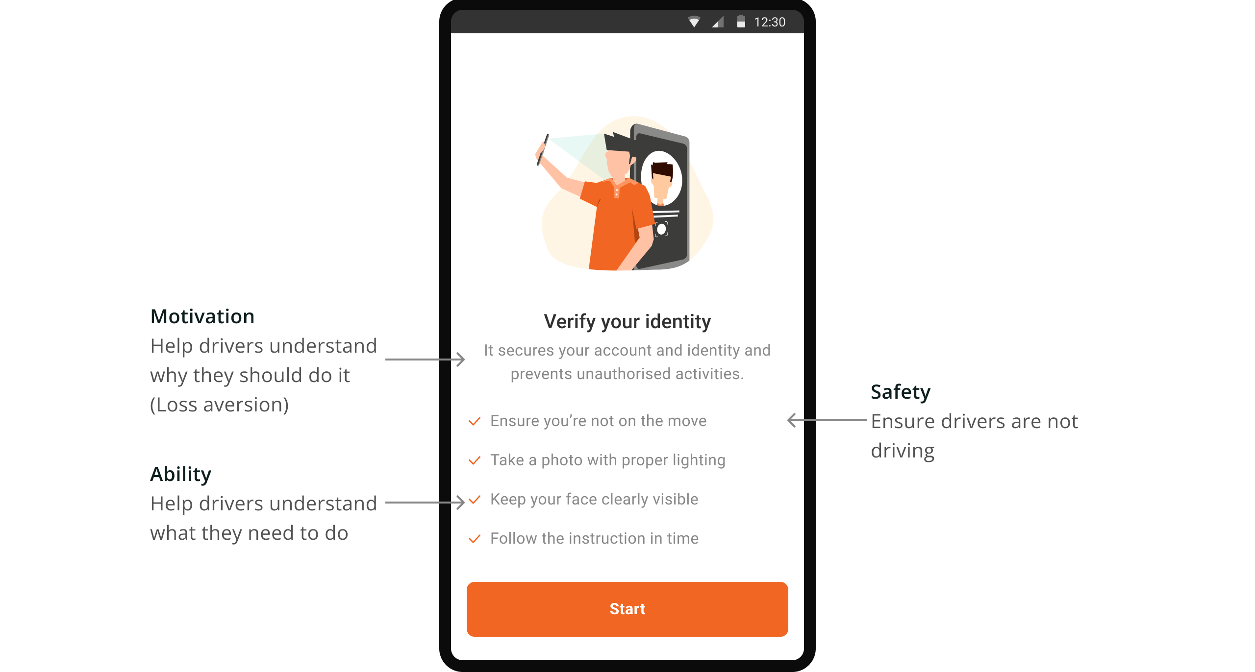
How do I make sure drivers are motivated and able to complete the check?
Once I figured out the high level of the ID check flow, I had to step back to the bigger picture and think about driver behaviors to complete the ID check.
Previous research showed drivers prioritize deliveries above all else, so I ensured they grasp its significance and have the time and space to complete it.

Motivation to complete the ID check as they often skip non-delivery-related tasks.

Ability to complete ID check, considering lighting, face angle, and surroundings.

Safety with minimal distractions while driving, especially when using the app from behind the wheel.
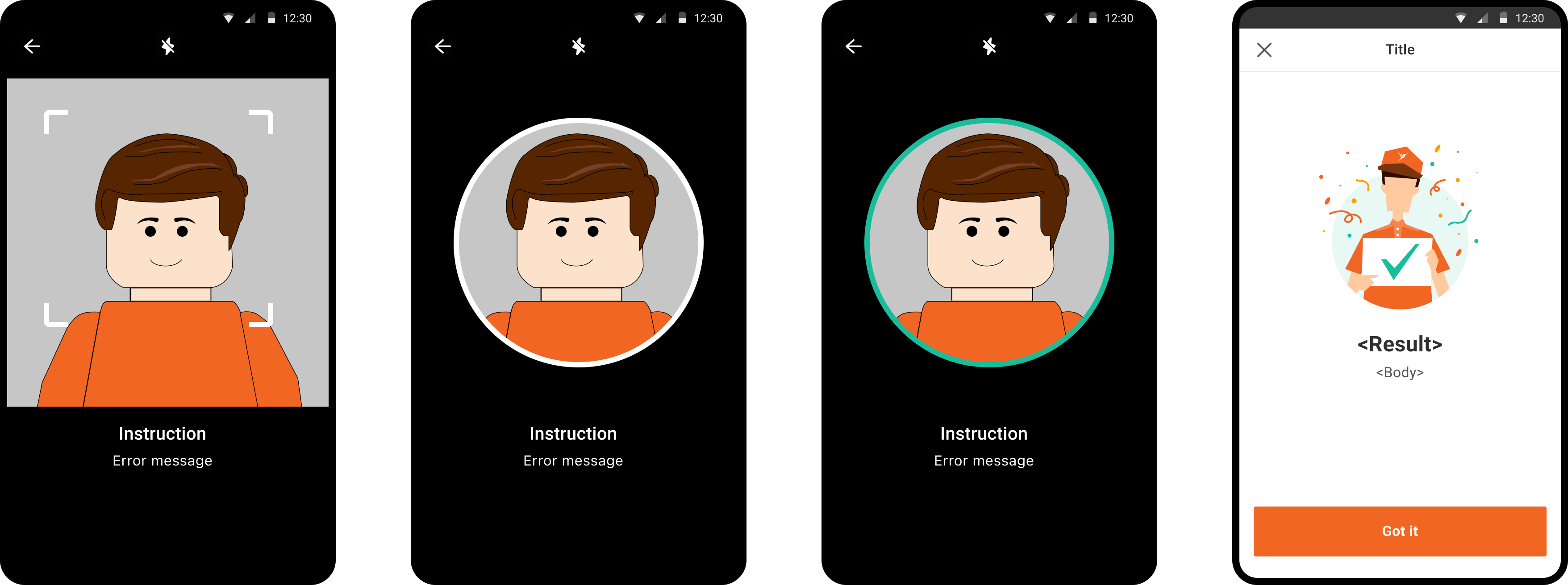
To ensure everything is set up correctly, I've added instructions that explain why this is important and how to create the best environment for it.
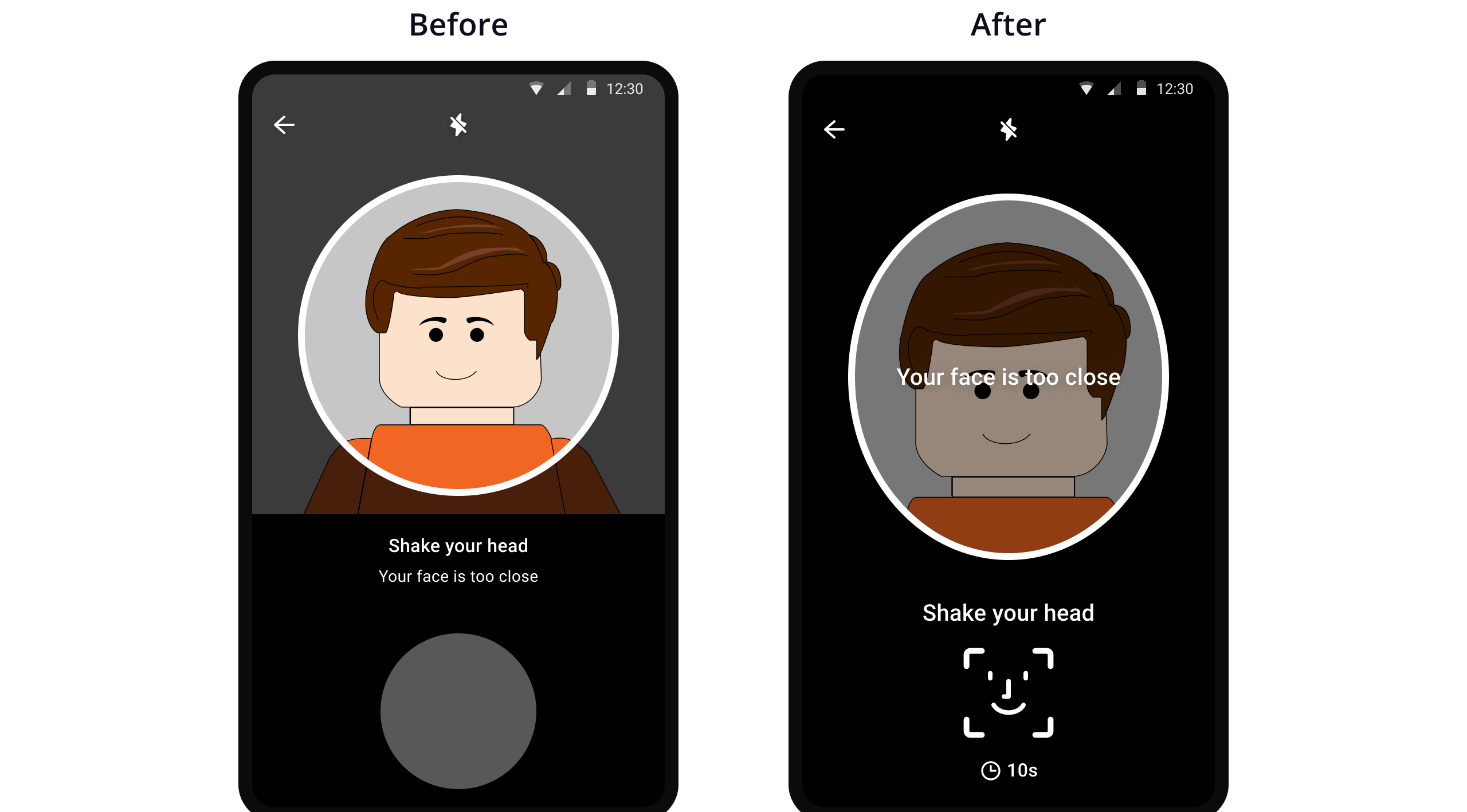
How do I make sure drivers know what to do?
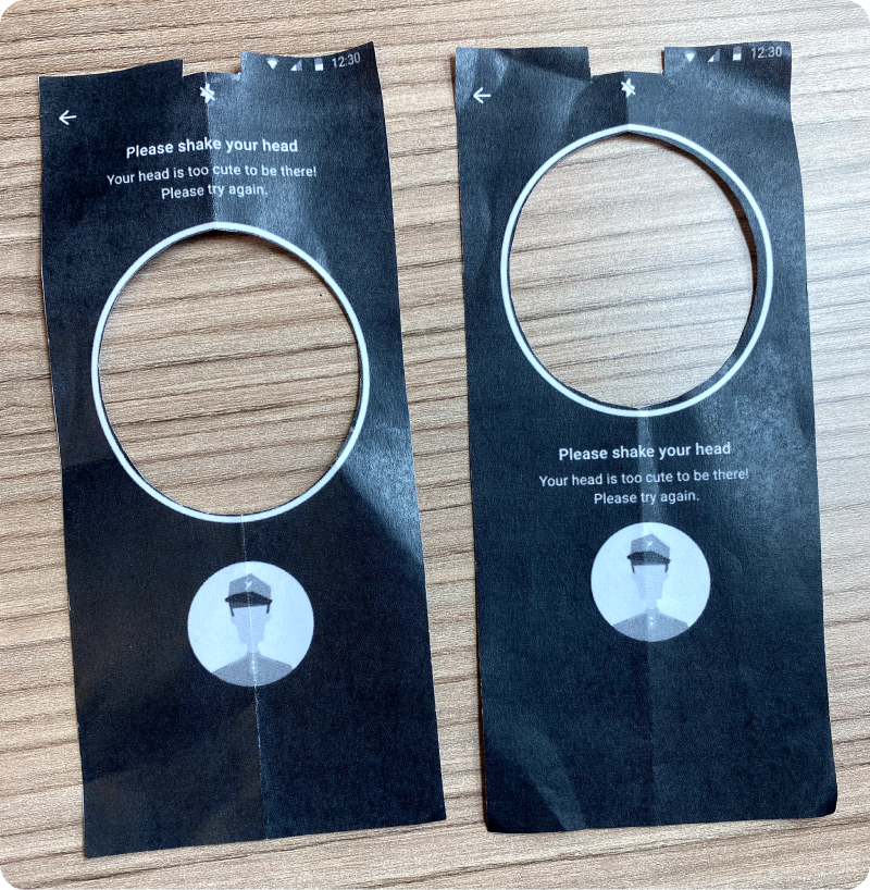
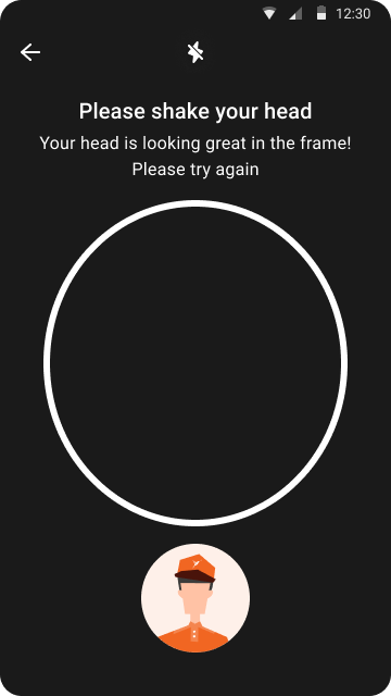
When I presented the idea to the design team first, a team member pointed out the clutteredness of different messages.
Initially, I grouped the error message with the instructions, assuming drivers would absorb all the information at once. However, since drivers should focus on the upper phone section when mounted near the windshield, there's a risk of the subtle text being overlooked.
To boost error message visibility, I placed them directly on the facial recognition frame. This way, as drivers adjust their face position on the screen, they are more likely to notice error messages.
Testing again with a realistic prototype
To reassess the design's usability, I prepared a more realistic prototype. The prototype includes camera functionality and gesture animation so that I can get better feedback on interactions.
I conducted a test with 4 individuals who had no prior context, using a Protopie prototype.
I assumed the mindsets of our drivers and office workers unfamiliar with our project have similar behaviors.
How do you describe the overall experience?
How easy was it for you to complete the process on a scale of 1 to 5?
Are there any difficulties or confusion during the process? If so, can you explain?
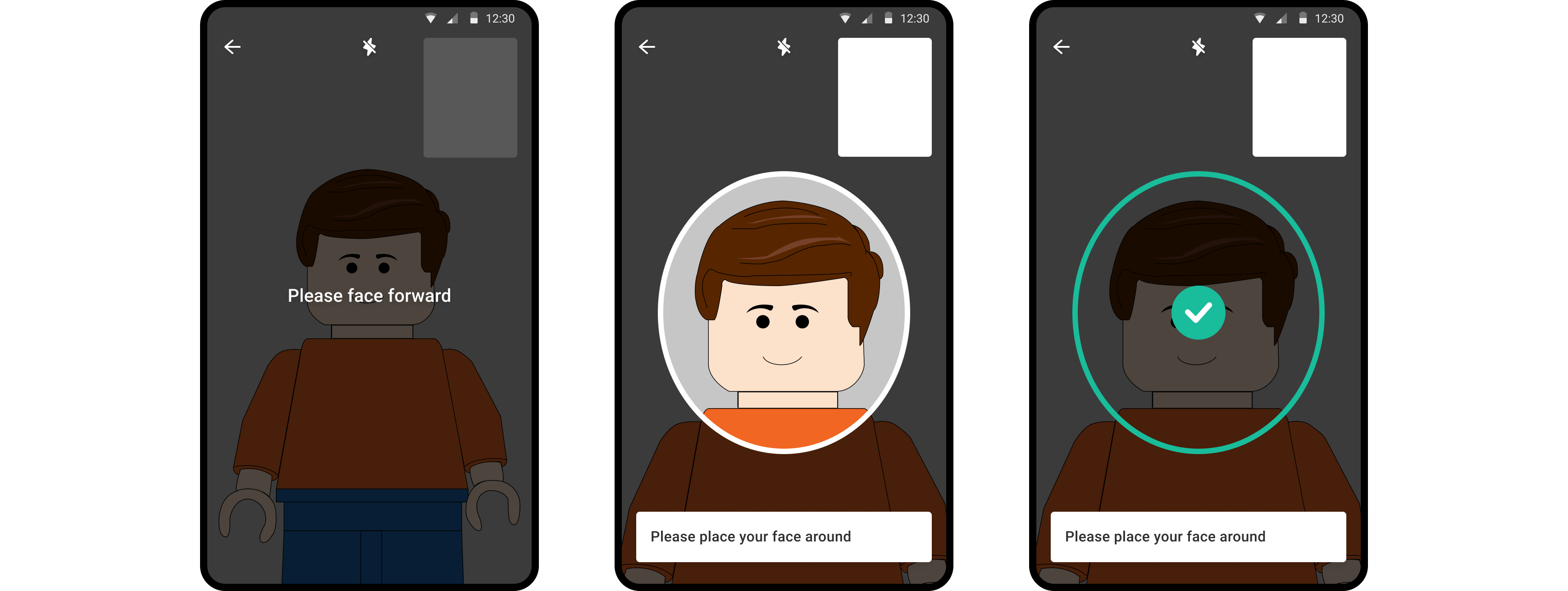
Feedback from high-fidelity prototypes
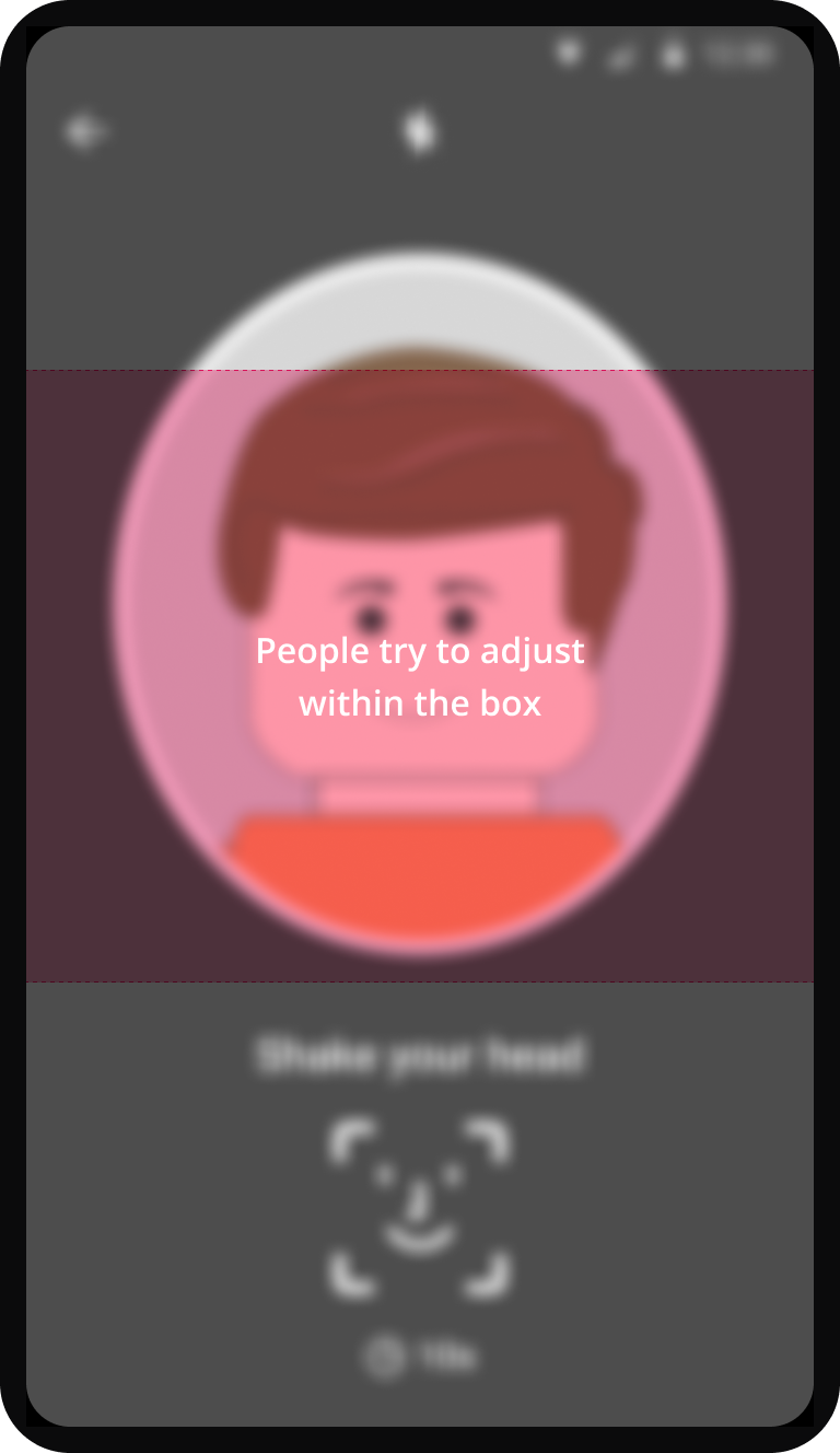
Participants struggled to fit their faces in the frame, noting that the frame was too small and too high although they were holding up the phone.
Participants reported that they largely overlooked the animation, focusing instead on the frame and the camera's upper part.
Participants expressed uncertainty about when one action was completed and when to transition to the next.
Adjustments based on the feedback
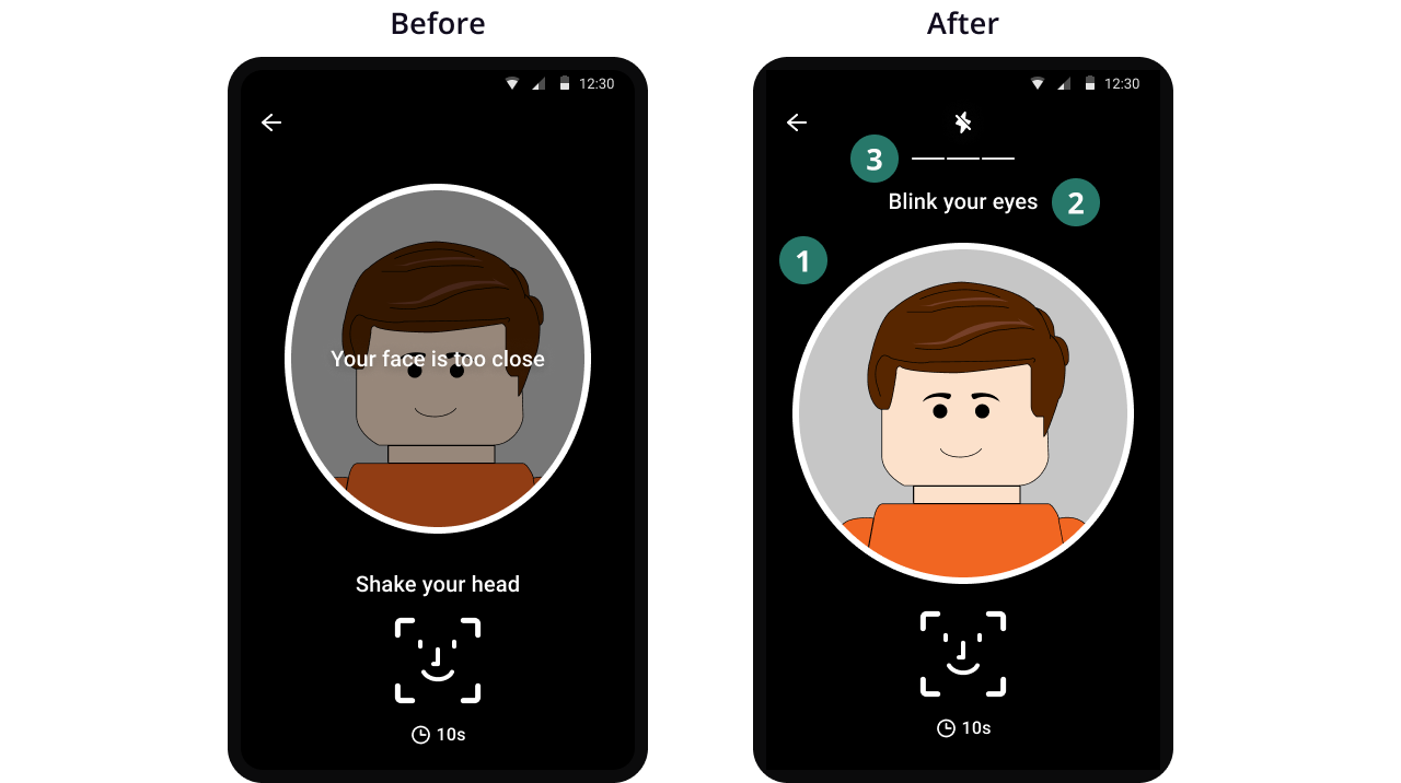

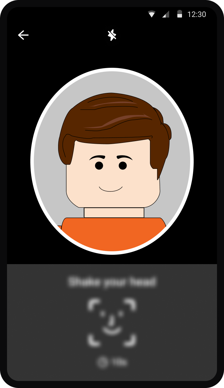
Making the frame bigger so that drivers can easily fit their faces.

Placing the instruction above the frame lowers the frame to direct drivers' attention to the instructions, considering their focus on the top part of the camera.

Adding a stepper at the top provides clear cues to help drivers know when they have finished a set of gestures and proceed to the next step.
Don’t forget to provide clear feedback on the facial recognition results
I didn't forget to add the flow before and after the check.
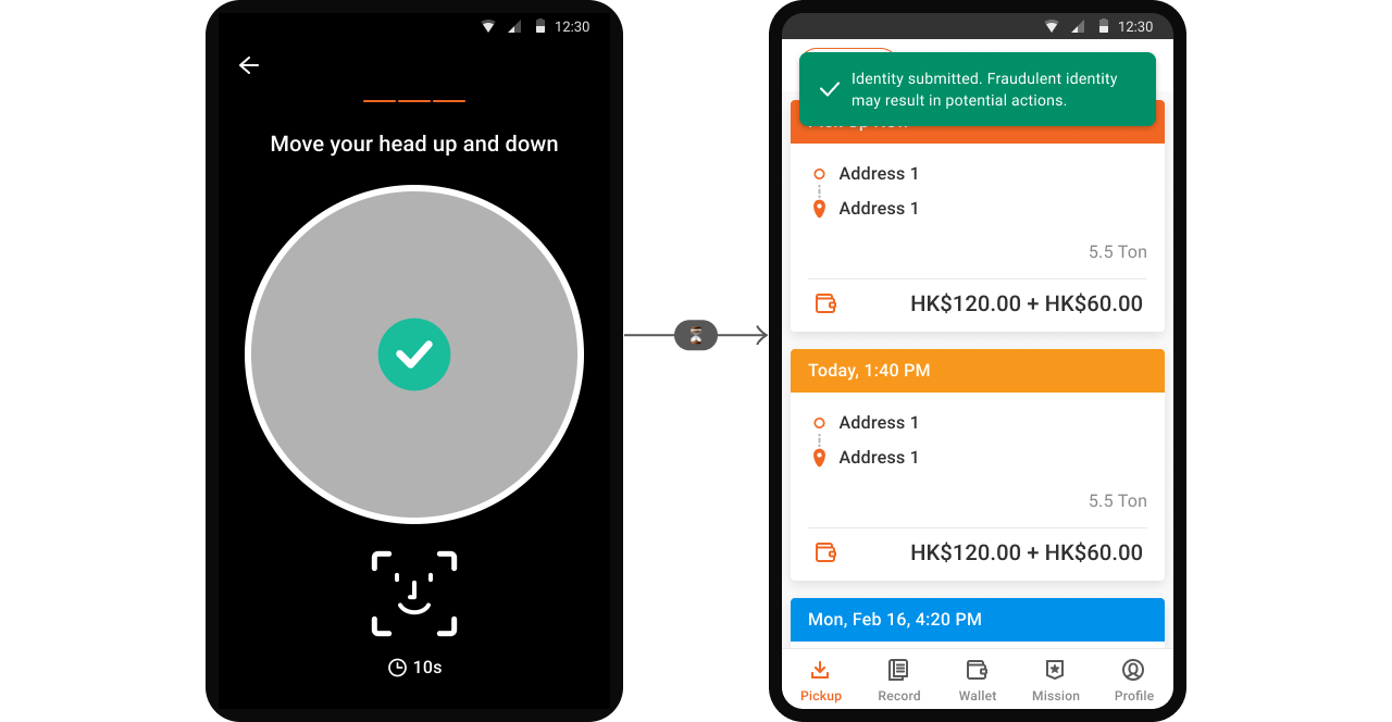
We are NOT verifying their identity instantly on the app given the primary aim of this MVP being data collection.
Communicating the success
Communicate promptly about the verification result, ensuring transparency. After facial recognition, the app swiftly moves to the main page with minimal feedback, meeting user expectations of an immediate transition.
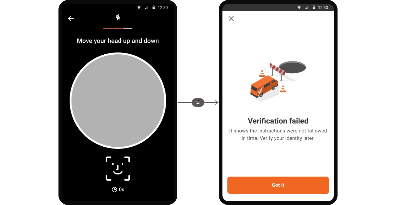
Communicating the fail
To reduce driver inconvenience and optimize driver availability, we allow only one selfie attempt. Even failed attempts can help refine our facial recognition model.
An error message is shown if the process takes over 20 seconds, with no requirement for a repeat attempt.
Final design
Launched the static configuration without gesture in a testing market
Submission completion rate
97.5%
Completion rate under 6 secs
75.7%
Next steps
We need to investigate and improve the issues of dark and blurry images.
While there were positive outcomes, there is room for improvement. Dark or blurry images were encountered despite our system's detection and guidance prompts.
We plan to progressively increase the number of drivers using this feature.
We started with the minimum required data to enhance our model. With little friction encountered, we are now expanding its application and utilizing the data to investigate possible fraud.
Learnings
High-fidelity prototypes prove more beneficial for gathering valuable feedback on usability.
High-fidelity prototypes are preferred for detailed usability feedback, despite the common emphasis on low-fidelity prototypes. Low-fidelity prototypes are better suited for basic concept testing, offering more general insights.
Past research can reveal unexpected insights that prove useful.
In this project, the way users hold their phones, a factor previously overlooked, became key to determining the frame position.
