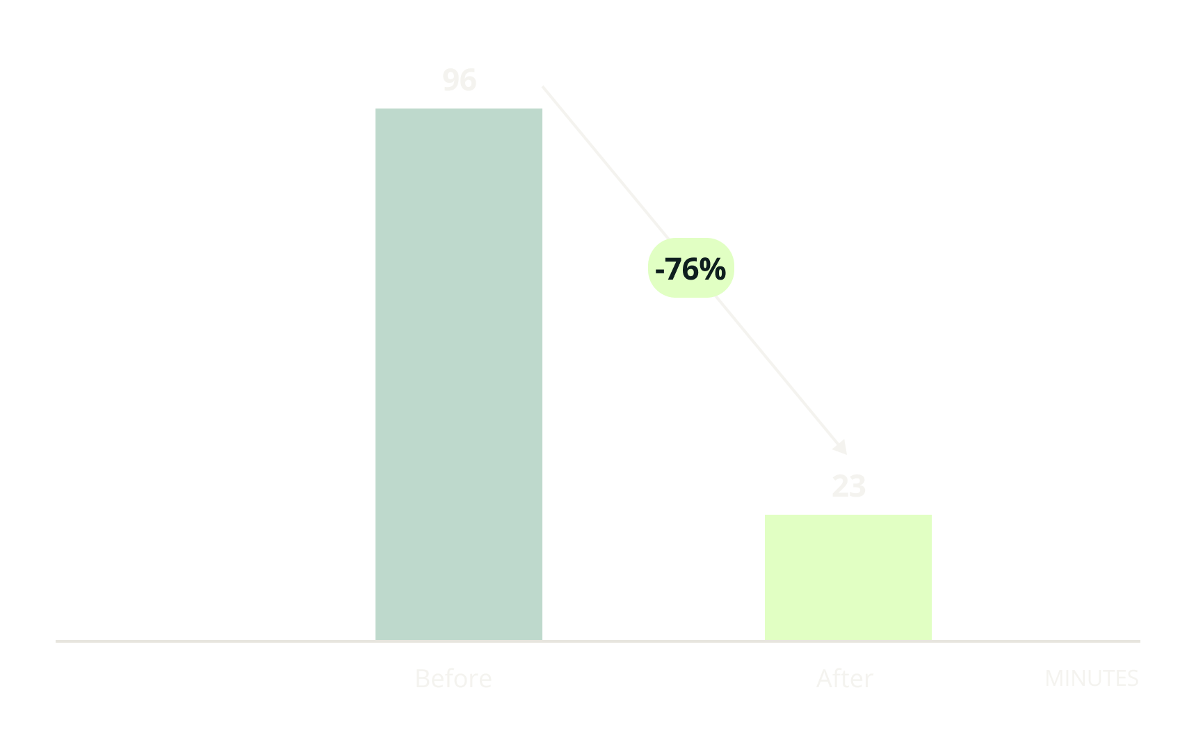
Reduces time spent on creating a course progress report by 76% with the new course dashboard
Simplified school admins' course progress analysis and reporting through user interview, requirement definition, and testing
Client - Lab.computer
Lab.computer is a web-based coding environment designed for programming education. It enables students to code and submit assignments online, while instructors can grade and provide feedback on assignments, eliminating the need to set up programming environments.
ROLE
As a product designer, for 3 weeks, I was responsible for:
• Gathering requirements by talking to the client
• Ideating and designing solutions and prototypes in collaboration with an engineer and founder
• Testing with the client to get feedback
• Handing detailed flows and design specs to engineers via Figma
The analysis feature potentially reduces the time for analyzing and reporting the course progress.
Potential time spent on creating a course progress report
-76%
CHALLENGE
One user expressed frustration over how he reports to his customers with Lab.computer.
When the client and I had a product feedback meeting with a user, the school admin user mentioned that he wanted to improve a way to extract grading for reporting to his client. We saw it as an opportunity that could differentiate the product in the market and believed that a solution could be an essential feature to sell the product to the targeted clients - schools and education services.
The problem statement is:
How can we make the analysis, reporting of course progress, and engagement faster and easier for professional school admins?
DISCOVERY
How can we make the analysis, reporting of course progress, and engagement faster and easier for professional school admins?
To understand user needs, I needed to understand his current process and pain points. I interviewed the user about “What,” “How,” and “When” he reports to the clients and the obstacles that he is facing in the process.
ASSUMPTIONS
I had to make assumptions since I could only talk to one user who requested the feature.
• Every professional school admin needs to analyze when they need to report course progress.
• Most corporate trainers visualize the analysis instead of handing over a spreadsheet.
FEATURE DEFINITION
Based on the discussion with the client, I defined the high-level requirements for a solution.
Goal 1:
Users are able to manipulate the inputs and produce graphs.
Users can view the analysis with measurements:
Who students are (Individual students/whole class)
What students have done (Each quiz/assignment)
Time duration (Whole course duration)
Users can view the outputs:
Submission rate (%)
Score (%)
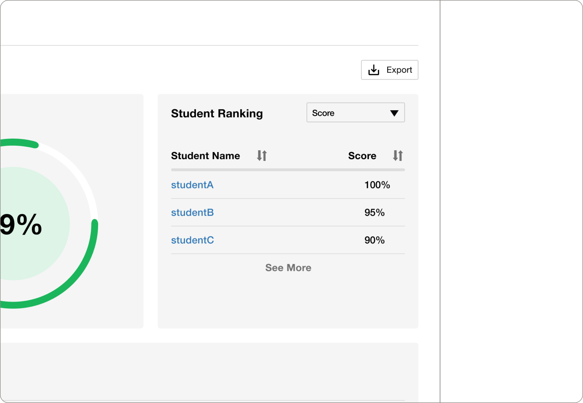
Ranking
Goal 2:
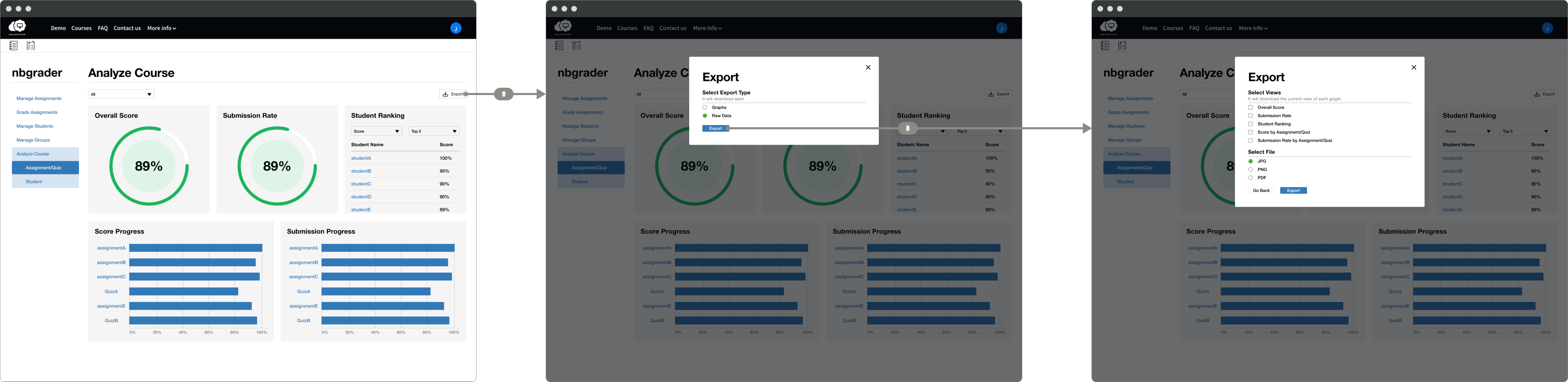
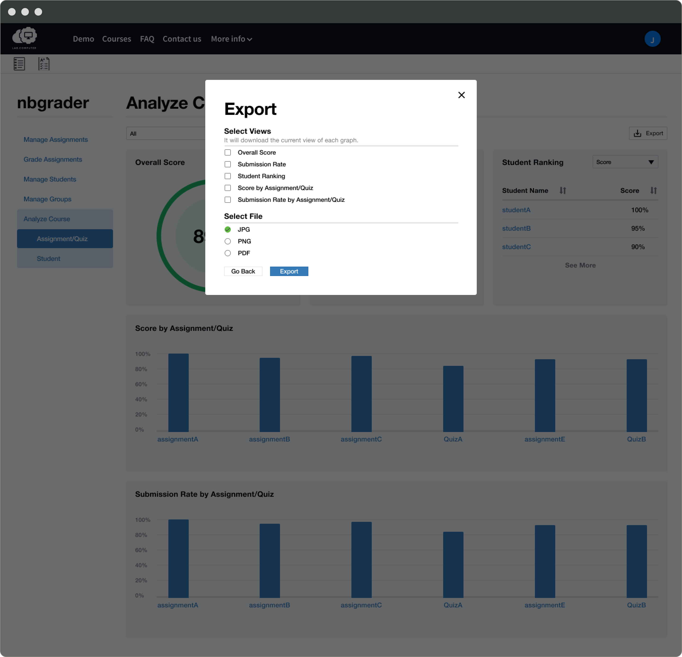
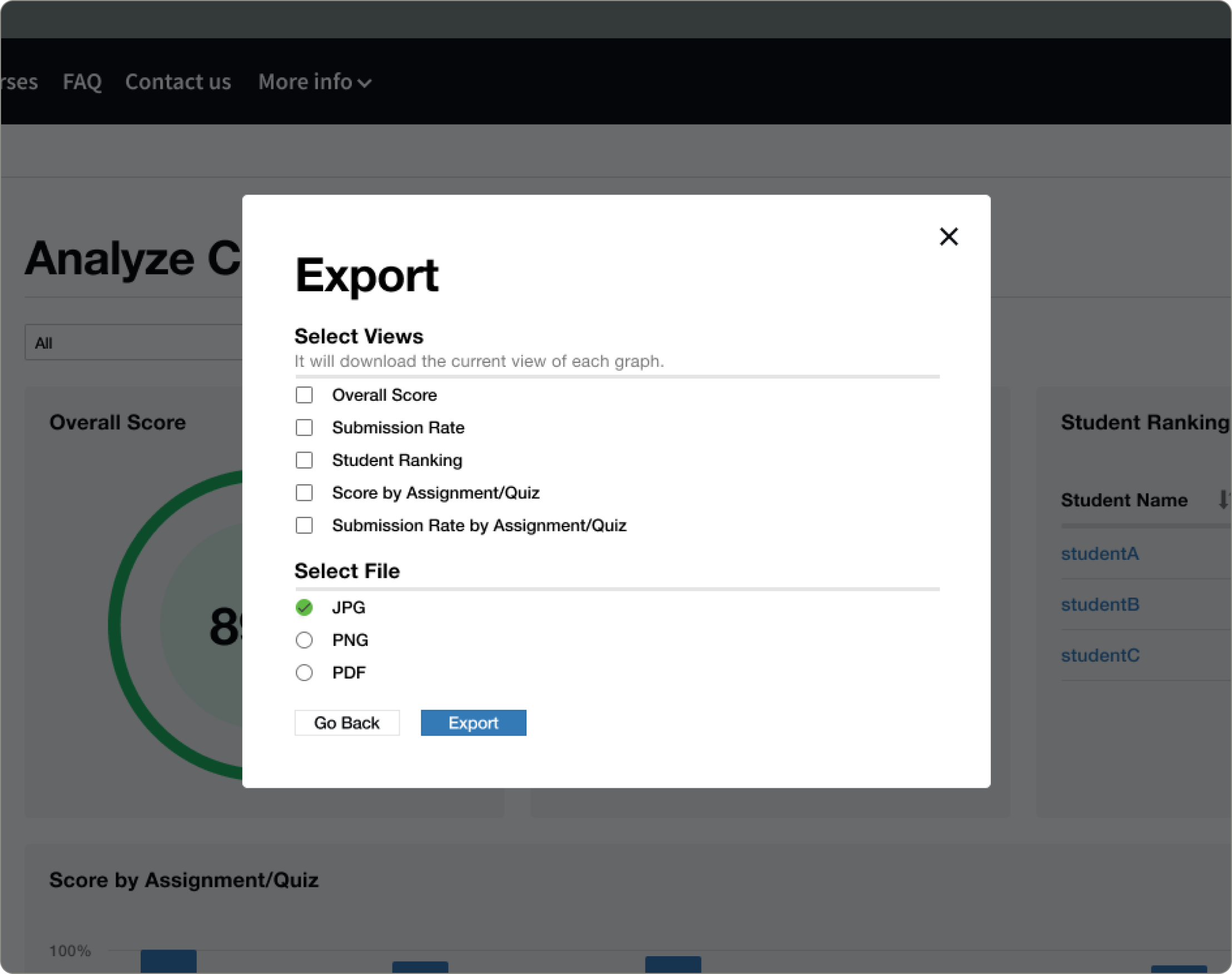
Users are able to download views to transfer to other reporting tools, such as Word document or PowerPoint.
Users can download in the form of:
PDF
PNG
JPG
Users can create:
One graph/view at a time
Selected graphs at once
SUCCESS METRICS
Reducing the total time spent creating course reports
Time spent creating overall course graphs
+
Time spent creating individual reports
×
Number of students
USER FLOW
With the requirements, I defined three possible user tasks with the feature.
Task 1:
Report the submission rate, the class score, and the top/bottom performers of each quiz
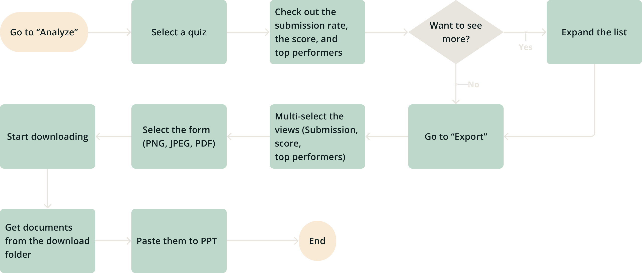
Task 2:
Report the submission rate, the class score, and top/bottom performers for a week
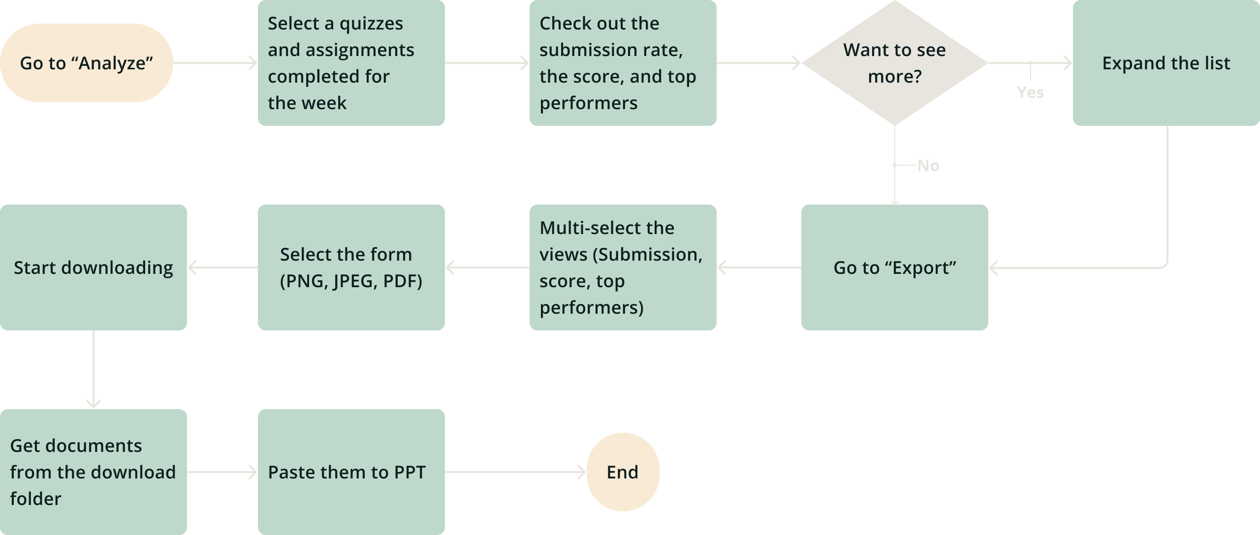
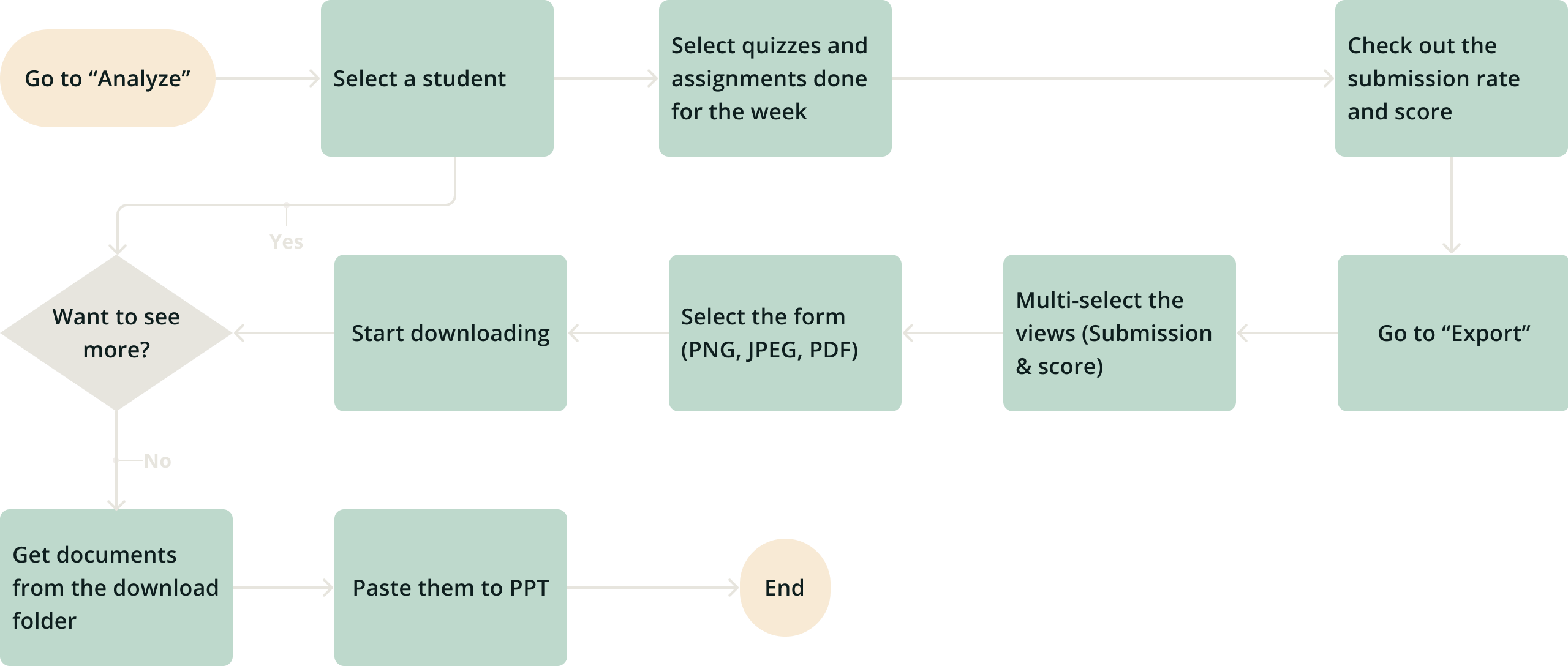
Task 3:
Report how individuals are doing weekly
Design
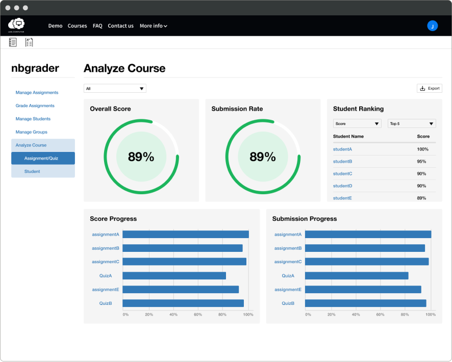
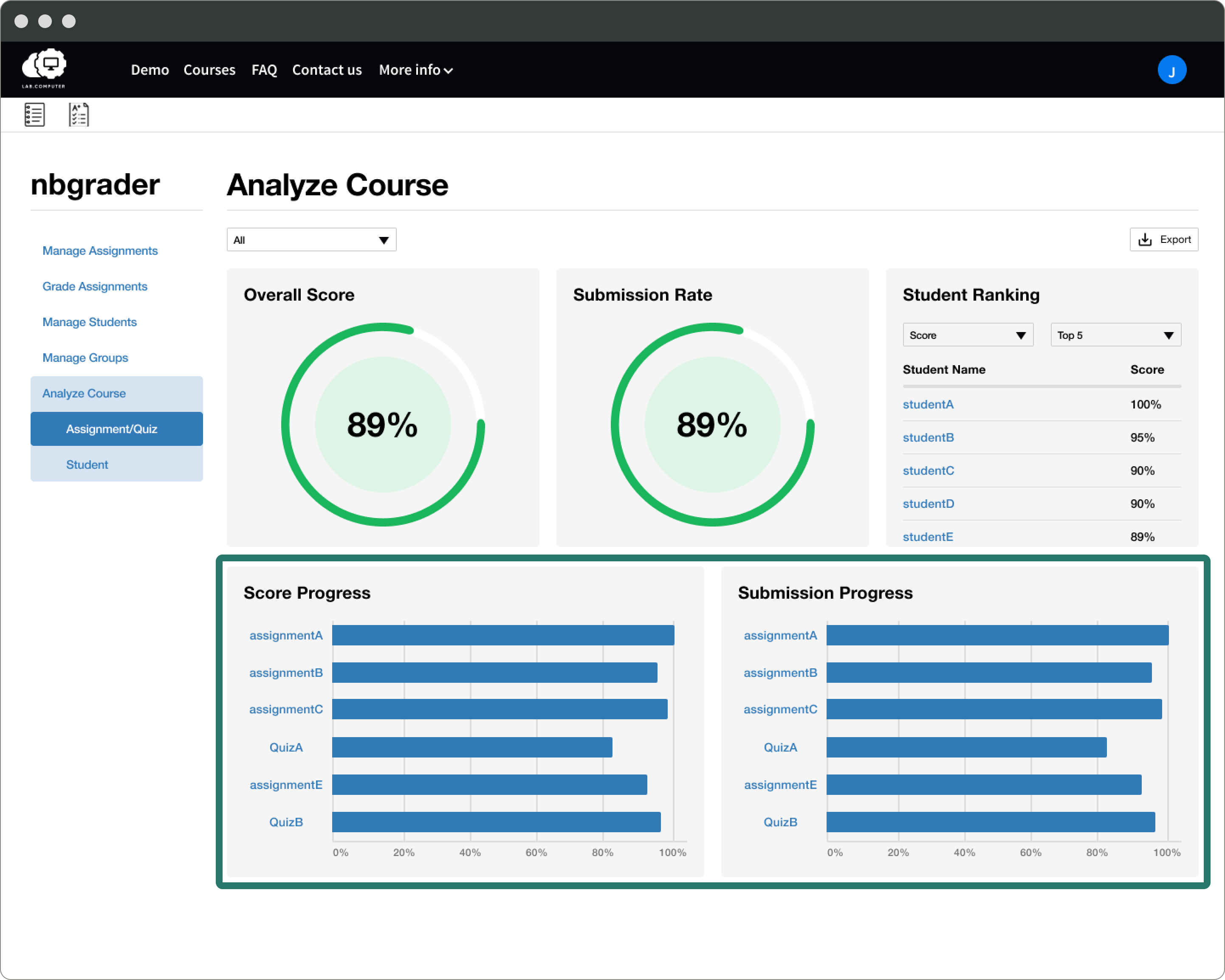
Quickly identify issues with scores and submissions
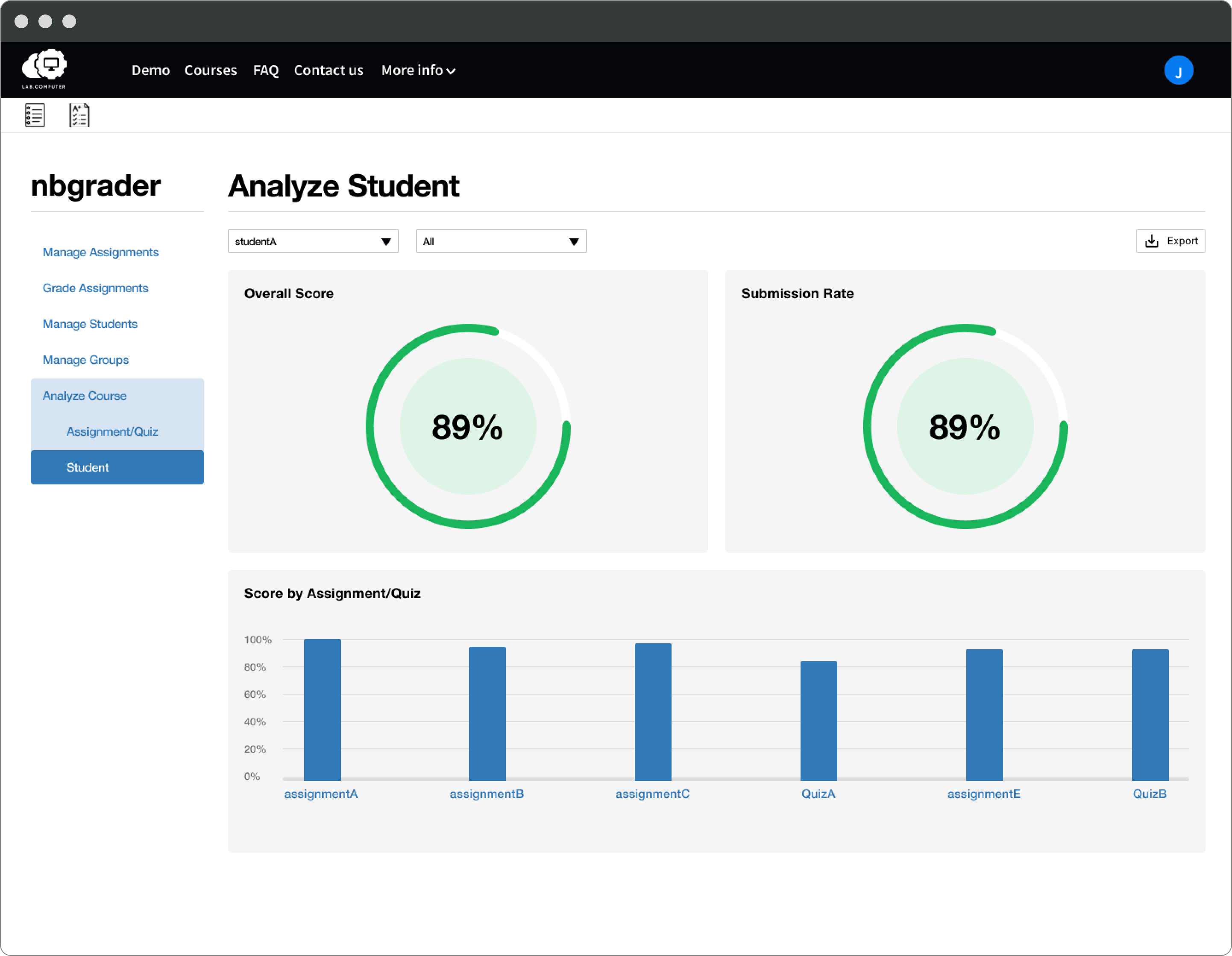
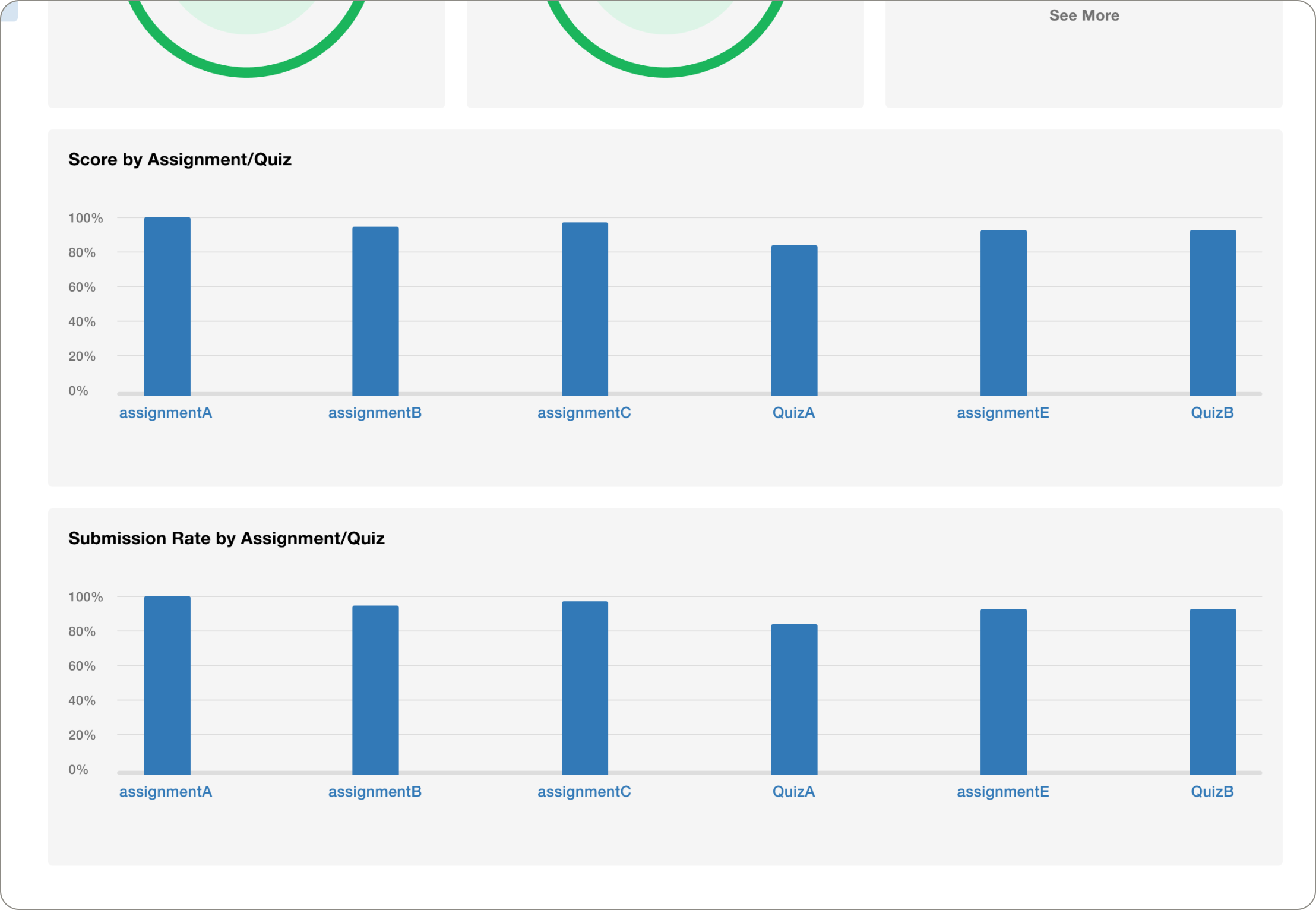
The user mentioned that he needs to produce graphs of the overall score and submission rate of assignments and student ranking.
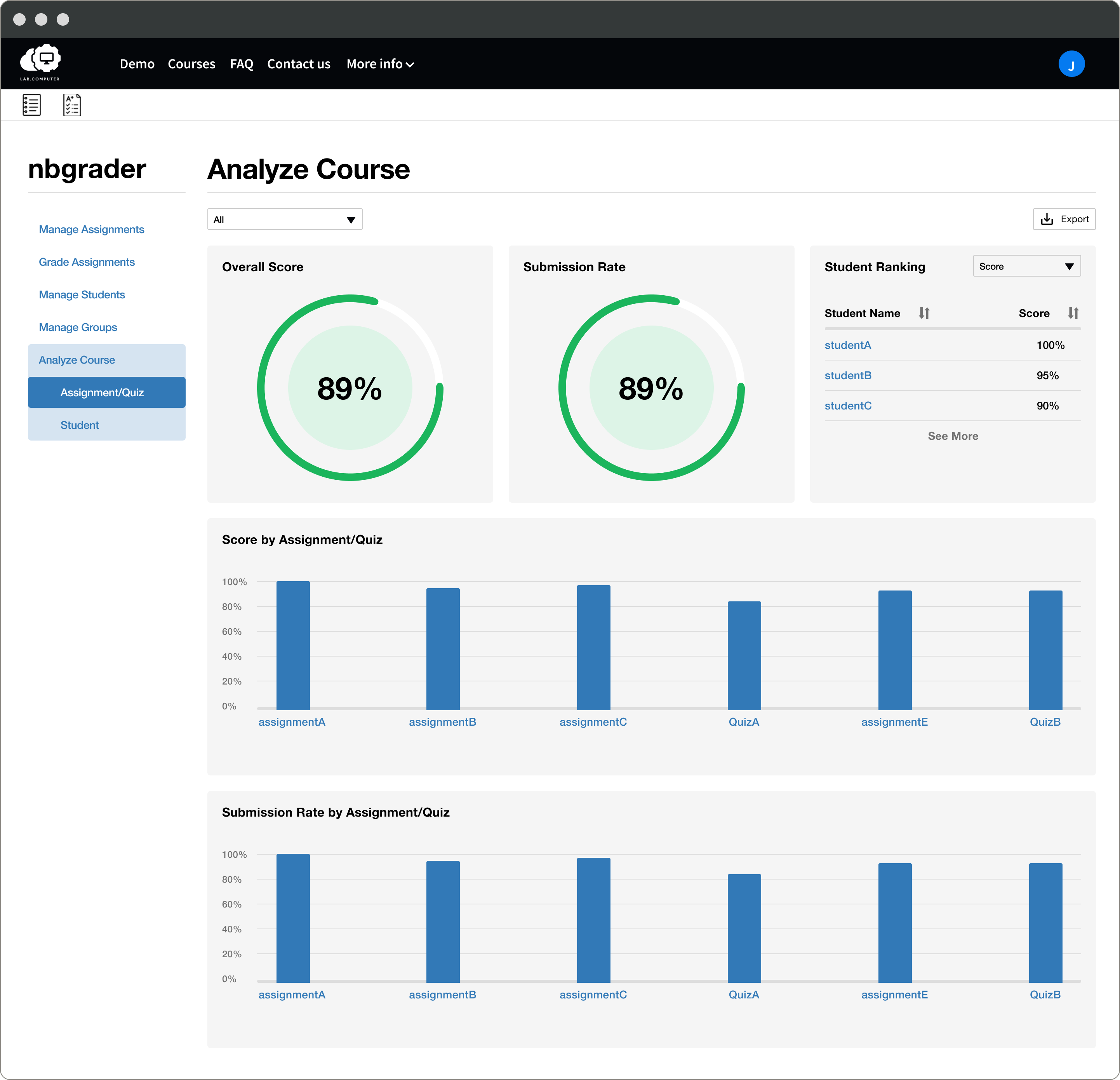
View the performance of each student
The user mentioned that he needs to produce graphs of the overall score and submission rate of each student.
Export graph views without the collection and manual analysis
The user needed to collect data and create graphs, which took a significant amount of time.
TESTING
I asked the client to perform 4 small tasks with the prototype.
• How do you look at the overall course performance in week 1?
• How do you download the charts and graphs for the overall course?
• How do you look at one student’s performance in week 1?
• How do you download the charts and graphs for the student's performance?
QUALITATIVE RESULT
He wants to see horizontal bars for the Assignment performance chart.
There is a class where he has more than 50 assignments. In order to show all of them on one page, a horizontal bar chart is better suited than a vertical chart.
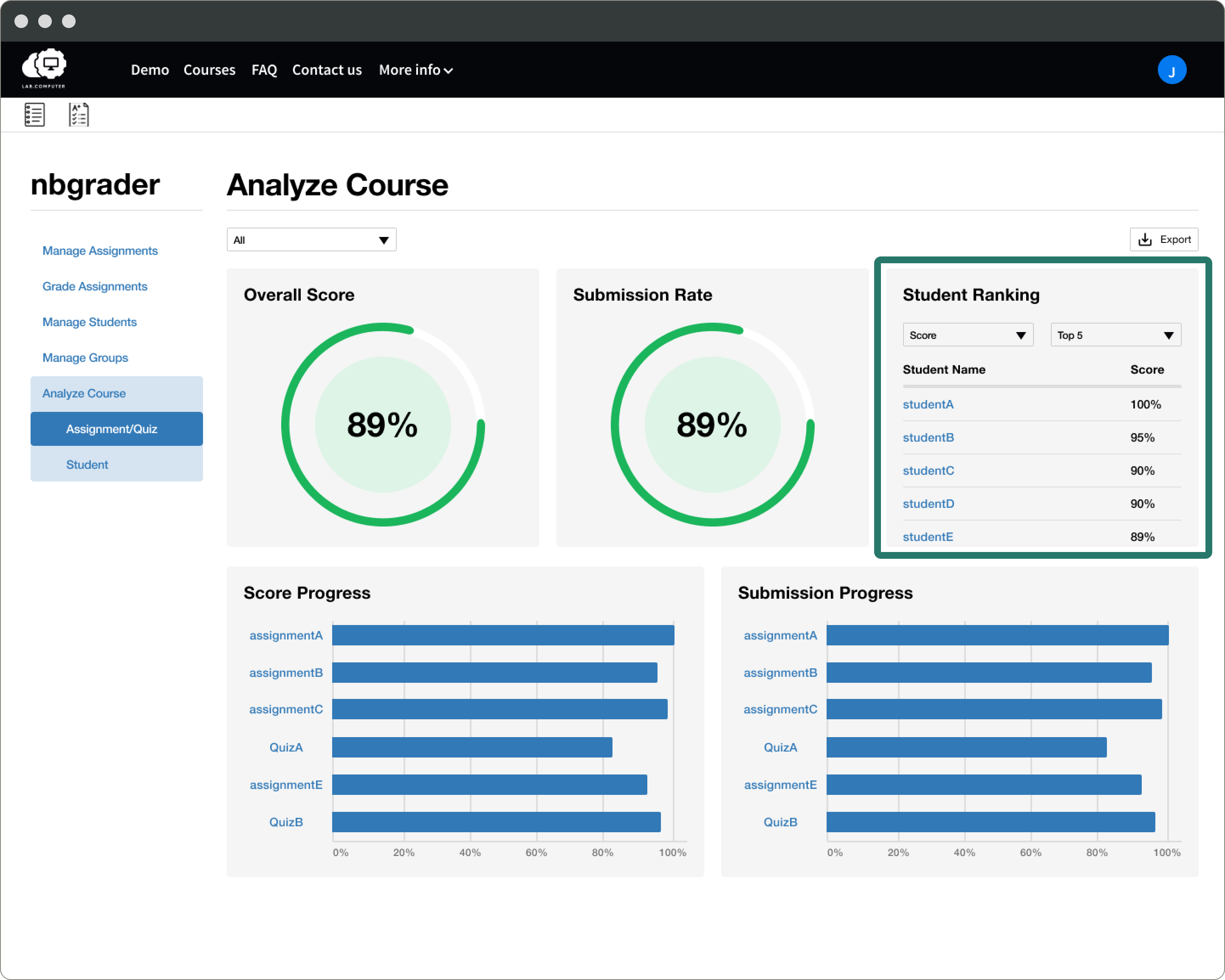
It was hard to know who are the top 5 or bottom 5 in the ranking.
He is only interested in looking at and exporting Top 5 or 10 and Bottom 5 & 10 rather than the full list.
He needs a raw data output.
He uses another platform for multiple-choice questions. In order to analyze the class progress, he might need to combine raw data from different platforms into one Excel file.
QUANTITATIVE RESULT
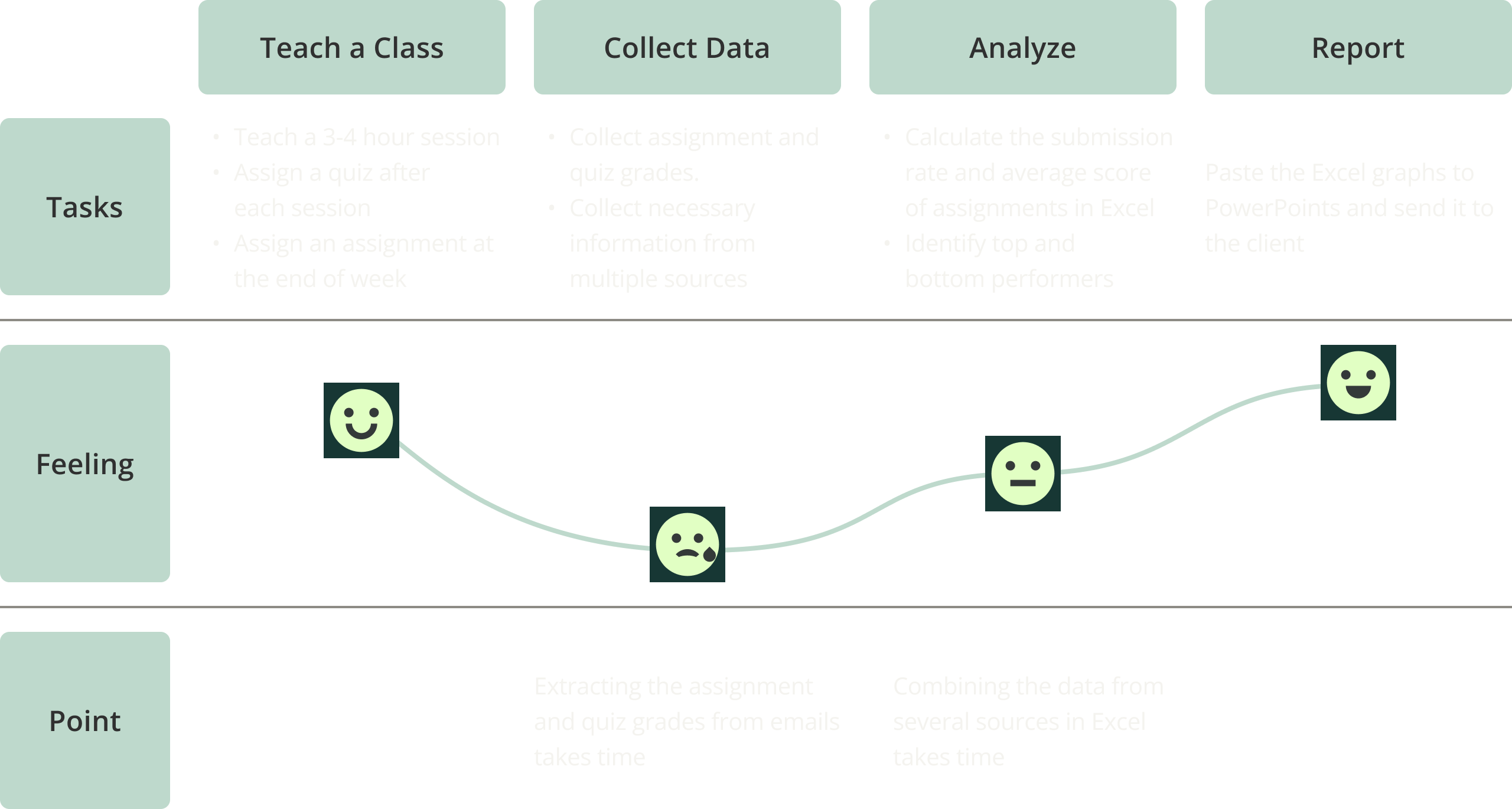
76% reduction in the total time spent reporting for a class of 30 students
During the testing, he spent 1.7 minutes on the overall course graph and 0.7 minutes on the individual student graph. In contrast, it takes him 3 minutes to extract a grade for one student and 6 minutes to create a graph using Excel.
ITERATION
Iteration 1:
He wants to see horizontal bars for the assignment performance chart.
A user can see the graphs with many assignments without scrolling, and the graph height will adjust based on the number of bars.
Iteration 2:
It was hard to know who are the top 5 or bottom 5 in the ranking.
A user can have Top 5, Top 10, Bottom 5, Bottom 10, and the full list on the student ranking.
Iteration 3:
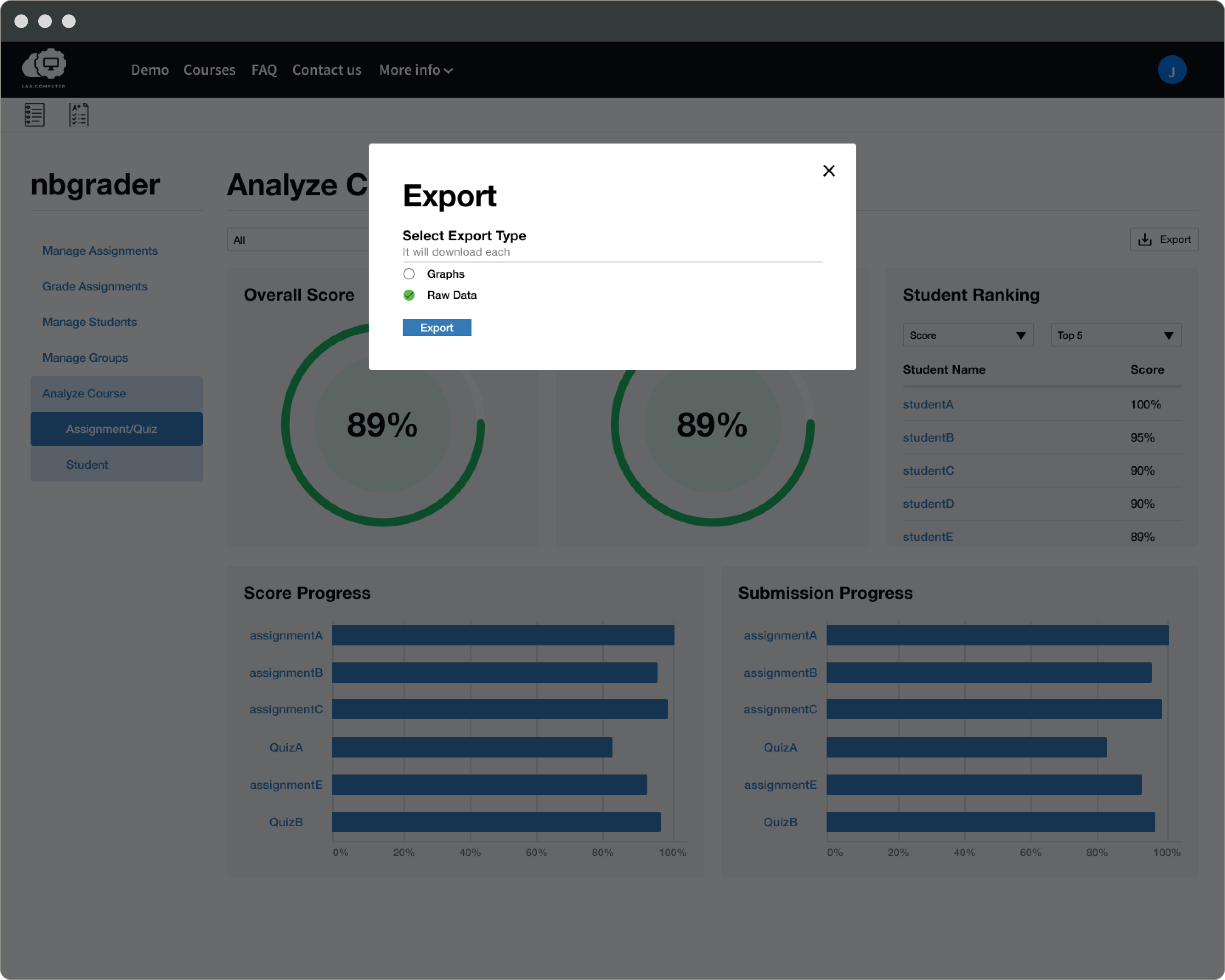
He needs a raw data output.
A user can select the raw data export at the beginning of the export process. (It is only available for the course analysis page.)
Final Design
Click the image to zoom!
NEXT STEP
The client implements the feature.
I couldn't assist with implementation since I was no longer part of the team when the client started implementation. I left UI specs for developers to implement the design pixel-perfectly.
LEARNINGS
Collaborating with one client/user enhances the feature by incorporating their insights and feedback.
Working with a single client streamlined the process by focusing on one voice instead of navigating varied feedback. However, seeking additional feedback would provide diverse perspectives to better cater to user archetypes.
It's crucial to understand the client's existing patterns and capabilities.
By maintaining constant communication with the client, I grasped their business needs and technical capabilities to design what they could build. Adhering to their current design ensured a consistent user experience, helping users understand how the new feature works.