Increase conversion rate by 3% by revamping vehicle selection
Reduced the wrong vehicle selections through problem analysis and design component development
Lalamove
Lalamove is an on-demand delivery platform that connects 13 million users with 1.2 million driver partners in 11 markets across the world. Lalamove driver-partner app is a tool for drivers to receive and manage delivery requests from customers.
ROLE
As a product designer, for 2 weeks, I was responsible for:
• Defining what we could solve with design with a product manager
• Designing the user interfaces and experiences for the feature
• Ensuring feasibility during ideation and alignment with design during implementation by consulting with engineers
• Handing over detailed flows and design specs via Figma
The new design reduced errors in vehicle selection and increased the overall conversion rate from registered to verified drivers
Wrong vehicle selection rate
-30%
Driver conversion rate
+3%
CHALLENGE
Changing drivers' vehicle types during registration increases operational costs and lowers the conversion rate.
Our business aims to boost driver supply efficiency and cut costs by streamlining registration. We identified an opportunity to optimize the verification process for driver vehicle types, addressing common errors made during registration, particularly in markets prone to frequent mistakes.
The problem statement is:
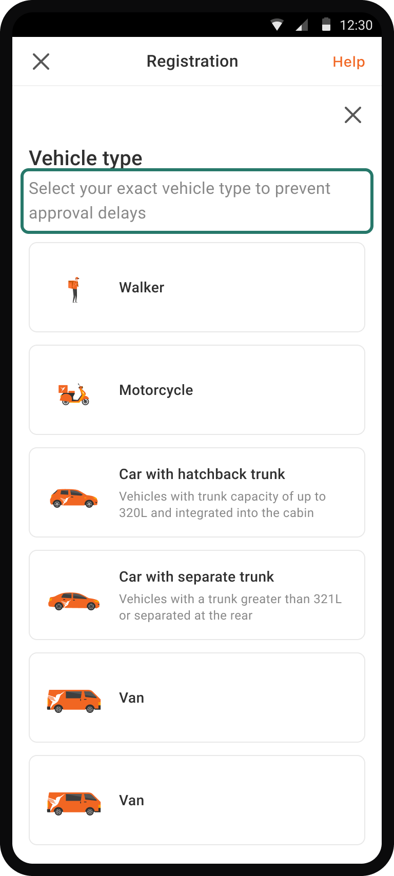
How might we help drivers select the right vehicle types, minimizing potential mistakes?
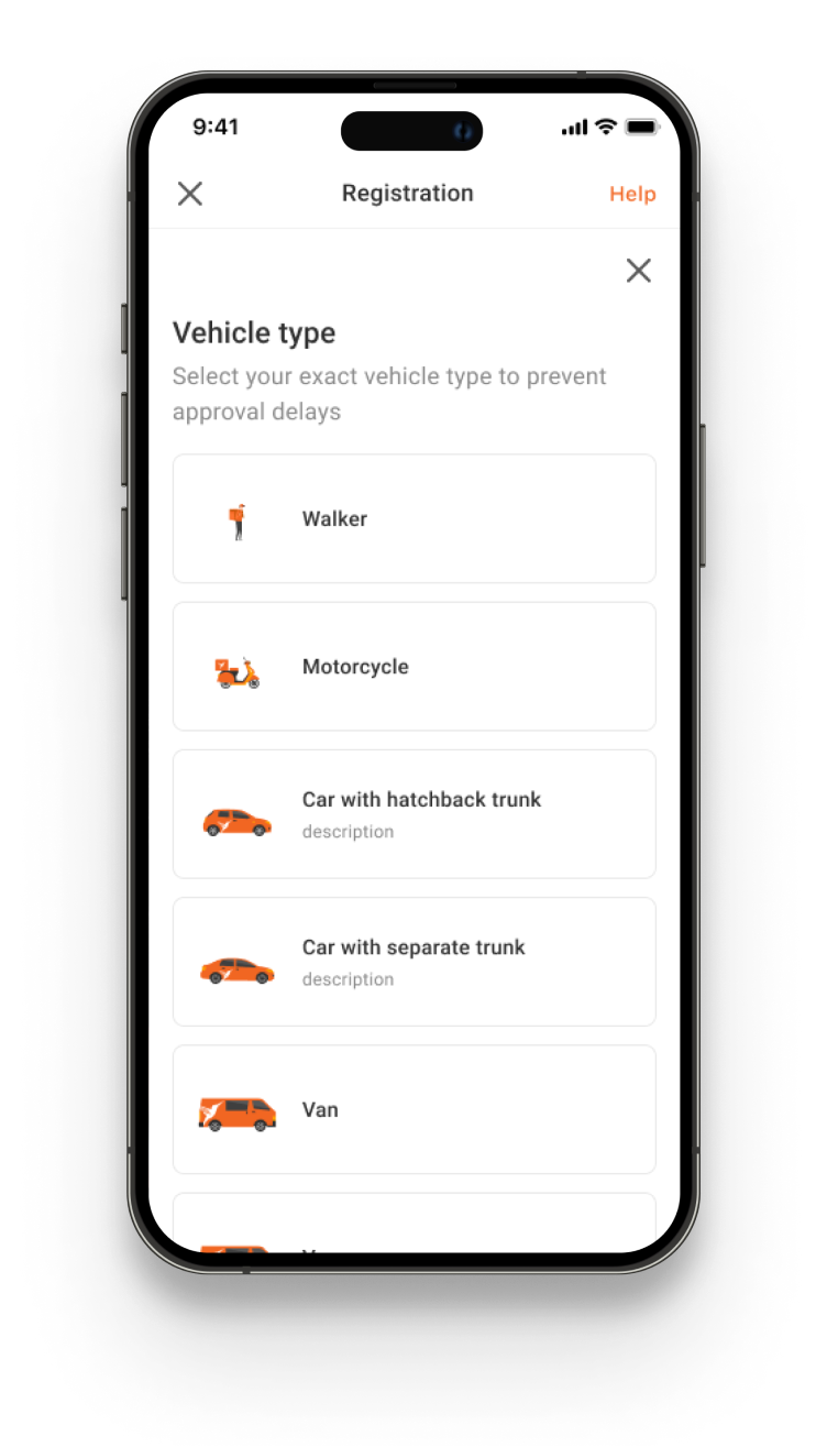
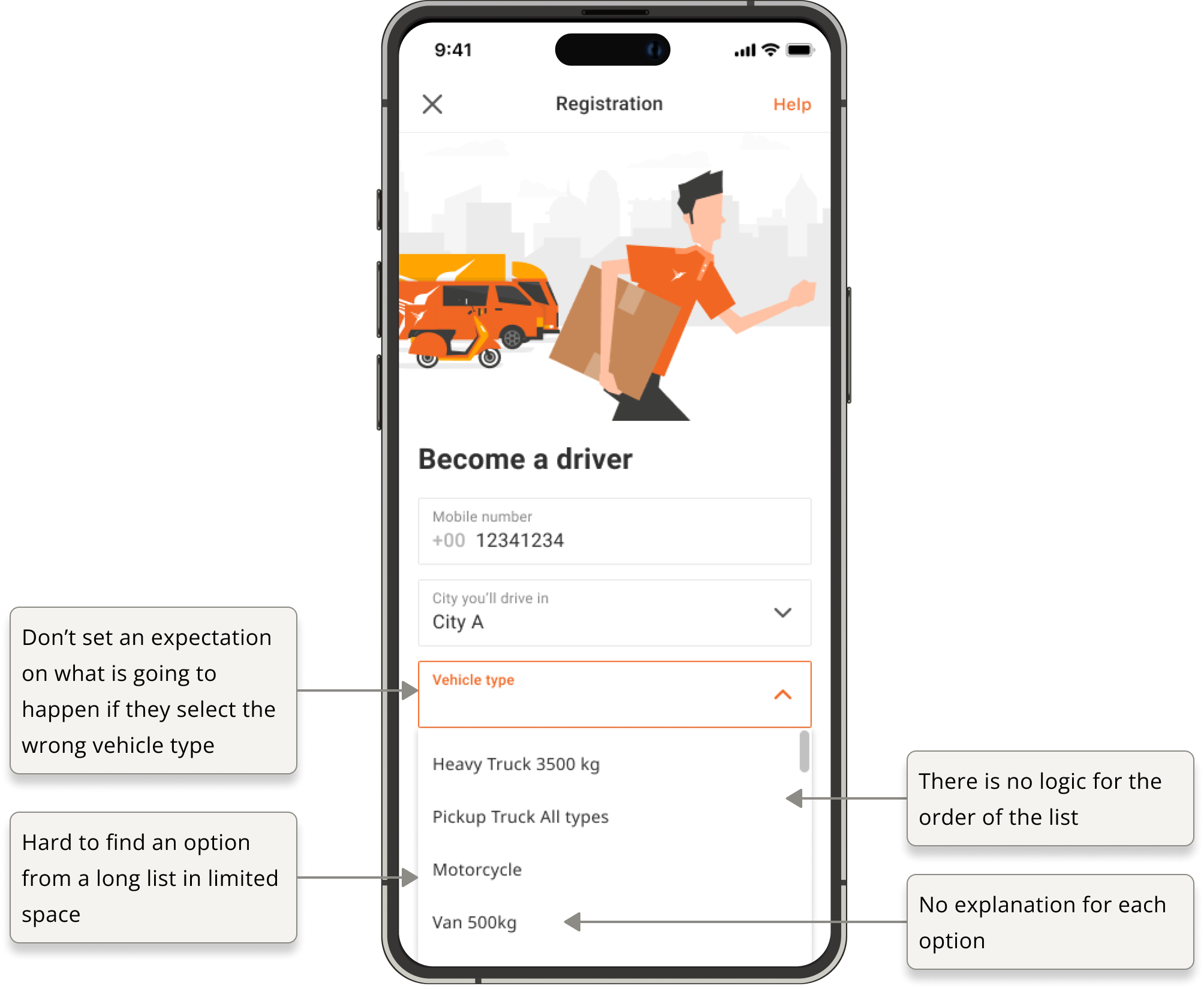
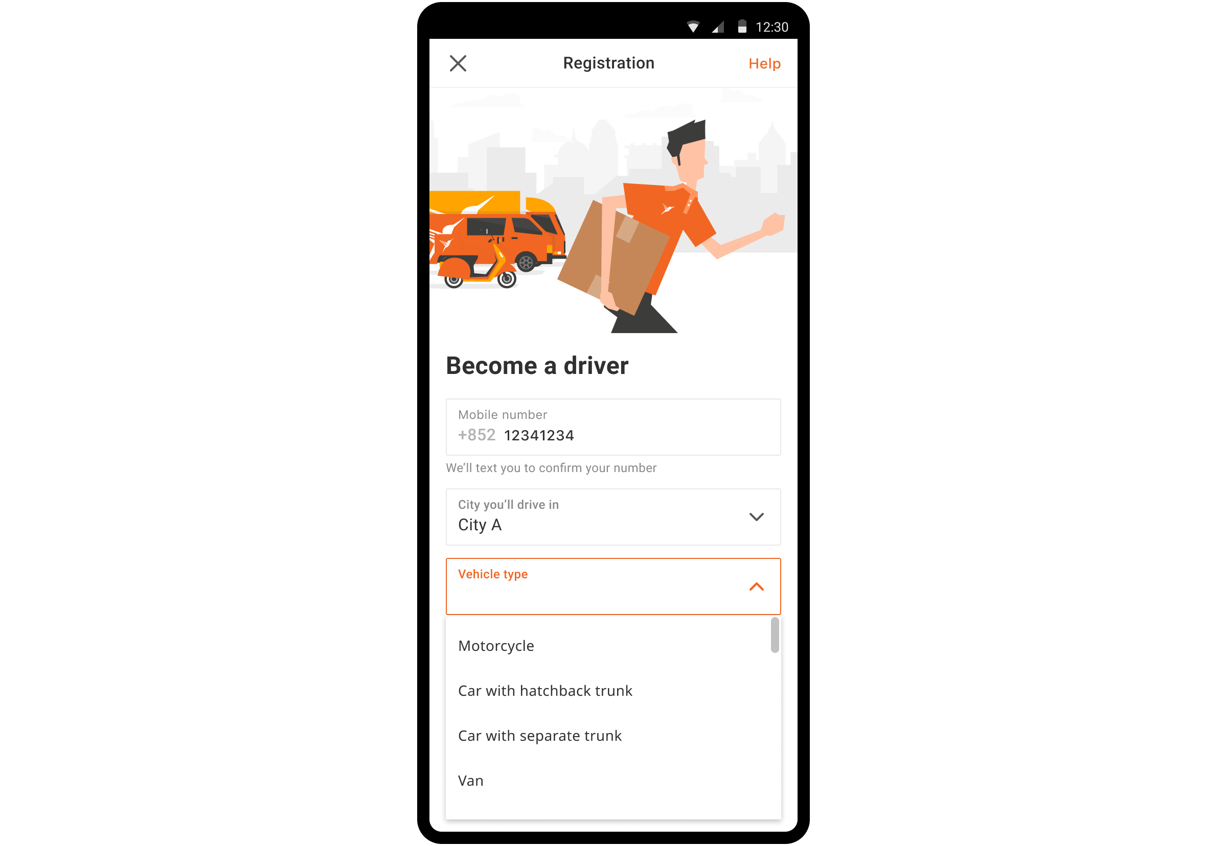
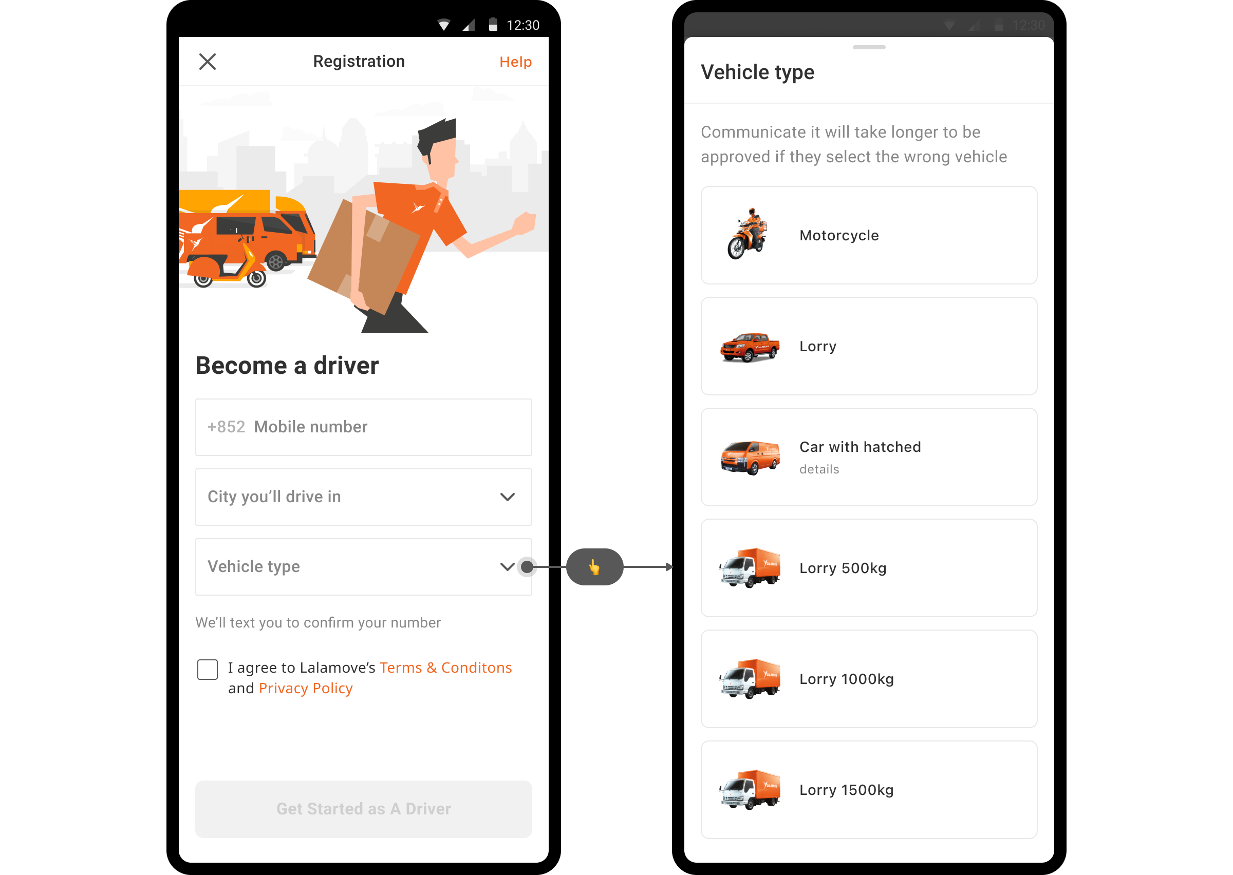
Existing design
During registration, drivers need to register their own vehicles to receive delivery requests.
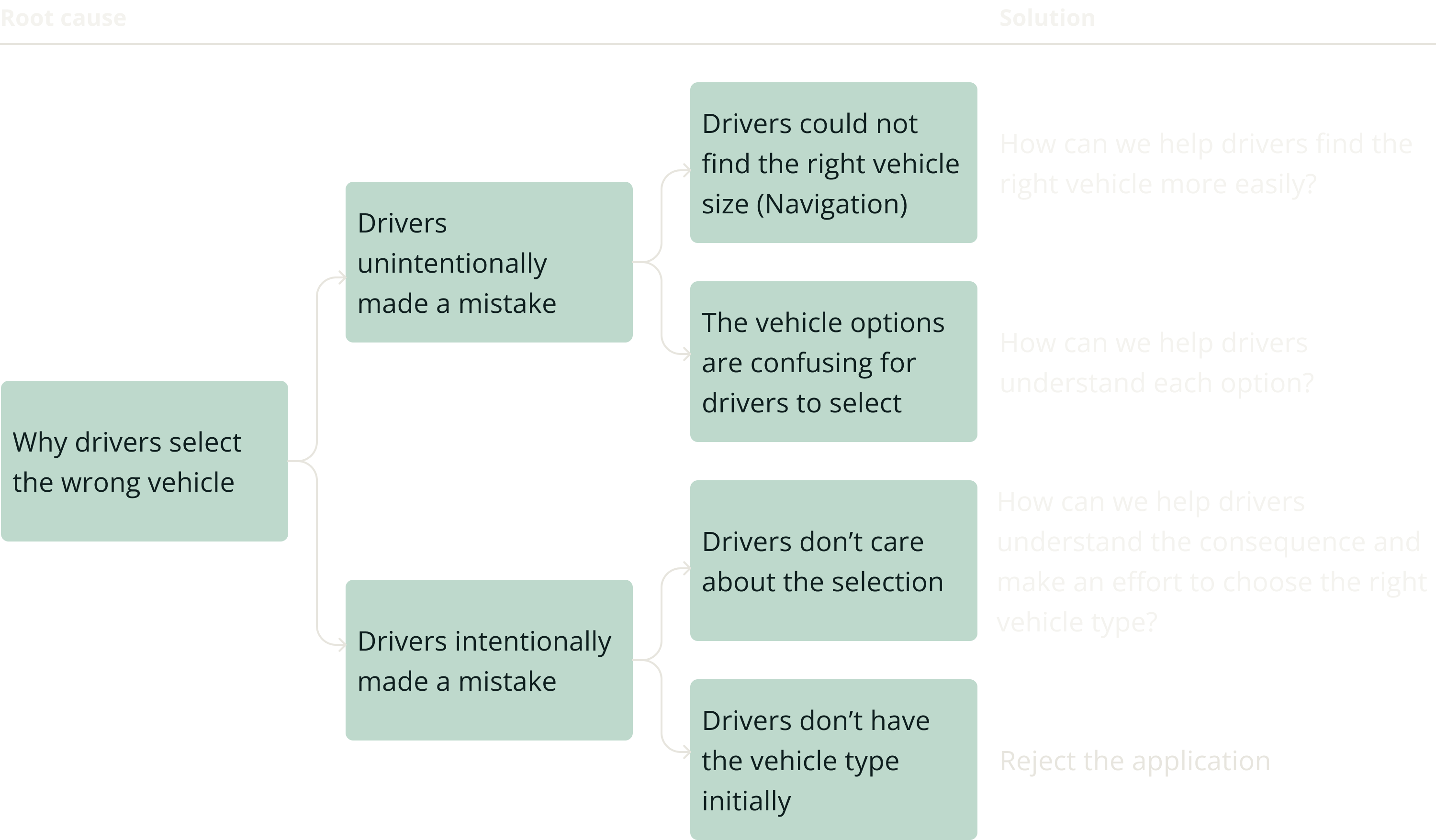
PROBLEM ANALYSIS
Vehicle selection errors resulted in operational delays and conversion drops: confusion between car types, oversight in pick-up car registrations, and random selections among motor drivers.
The product manager set up the initial analysis, and I helped them clarify the root causes of the problem by asking questions and suggesting different ways to structure and analyze the problem.
Market A
The market had 409 incorrect vehicle selections in a week, resulting in a workload of approximately 1 hour per day for the local operation team. The primary issue was the mismatch between Car and Hatch drivers which comprises around 60% of the incorrect selections. Assuming each agent takes 3 minutes to verify, additional 20 applications could be processed daily.
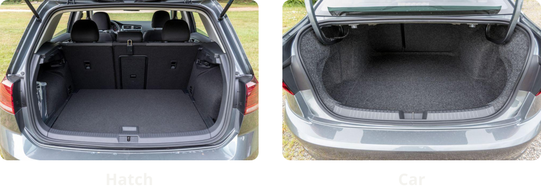
The distinction between a car and a hatch is that a car is a 4-door passenger car with a separate trunk, built on a three-box body. On the other hand, a hatchback is a 4-door vehicle with a tailgate that flips up, assembled on a two-box body. Drivers make the mistake because the difference is understandably confusing as the app doesn't give any explanation of the difference.
Market B
In Market B, around 10% of registrations with a pick-up car on average need to be converted to a car. Feedback from the local team revealed that drivers who selected the wrong vehicle type were either unaware of the car selection or did not see it as an available option.
Market C
During the registration, 23 motor drivers registered as 4-wheel drivers, accounting for 53% of the total rejected leads, which led to a conversion drop of over 10%. According to the feedback from the local team, drivers often choose the vehicle option randomly.
Existing design
Based on the data and local team feedback, I also analyzed the current solution and made assumptions about the underlying causes.
PROBLEM DEFINITION
Identify three major problems through problem structuring
Based on feedback and design assessment, I structured the problem and identified three major problems that form the scope of the design solution.
SUCCESS METRICS
To increase the driver conversion rate and ease the local operation team's workload
The product manager set the goal and success metrics for this feature. We want to target:
Reduction in the number of wrong vehicle type selections in registration
Reducing the local team’s workload by correcting driver vehicle selection errors
PRINCIPLES
The design goal is to enhance clarity and usability while not hurting the conversion rate.

Not hurting conversion rate
Adding steps to the registration process can harm the conversion rate, contrary to our objective.

Clarity on vehicle type
Resolving the lack of clarity between vehicle options effectively resolves the majority of the market issue.

External & internal consistency
To reduce cognitive load and enhance usability, I aimed to find the optimal solution for the cluttered design with overwhelming options.
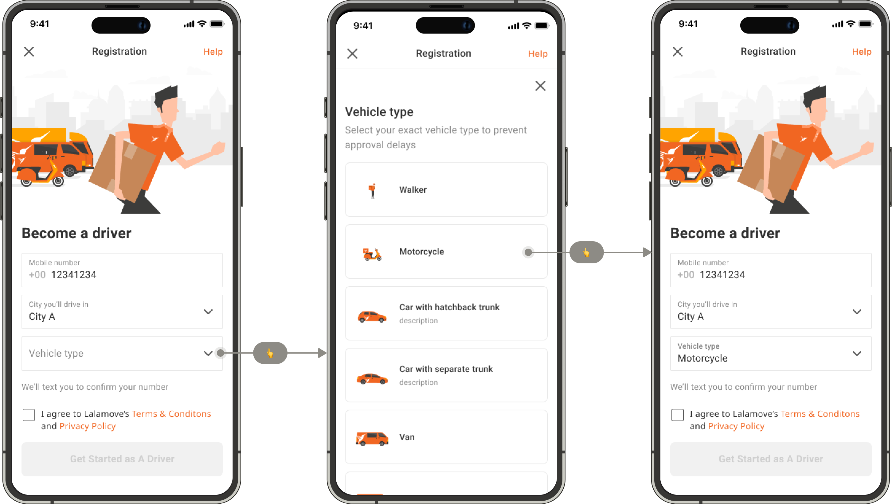
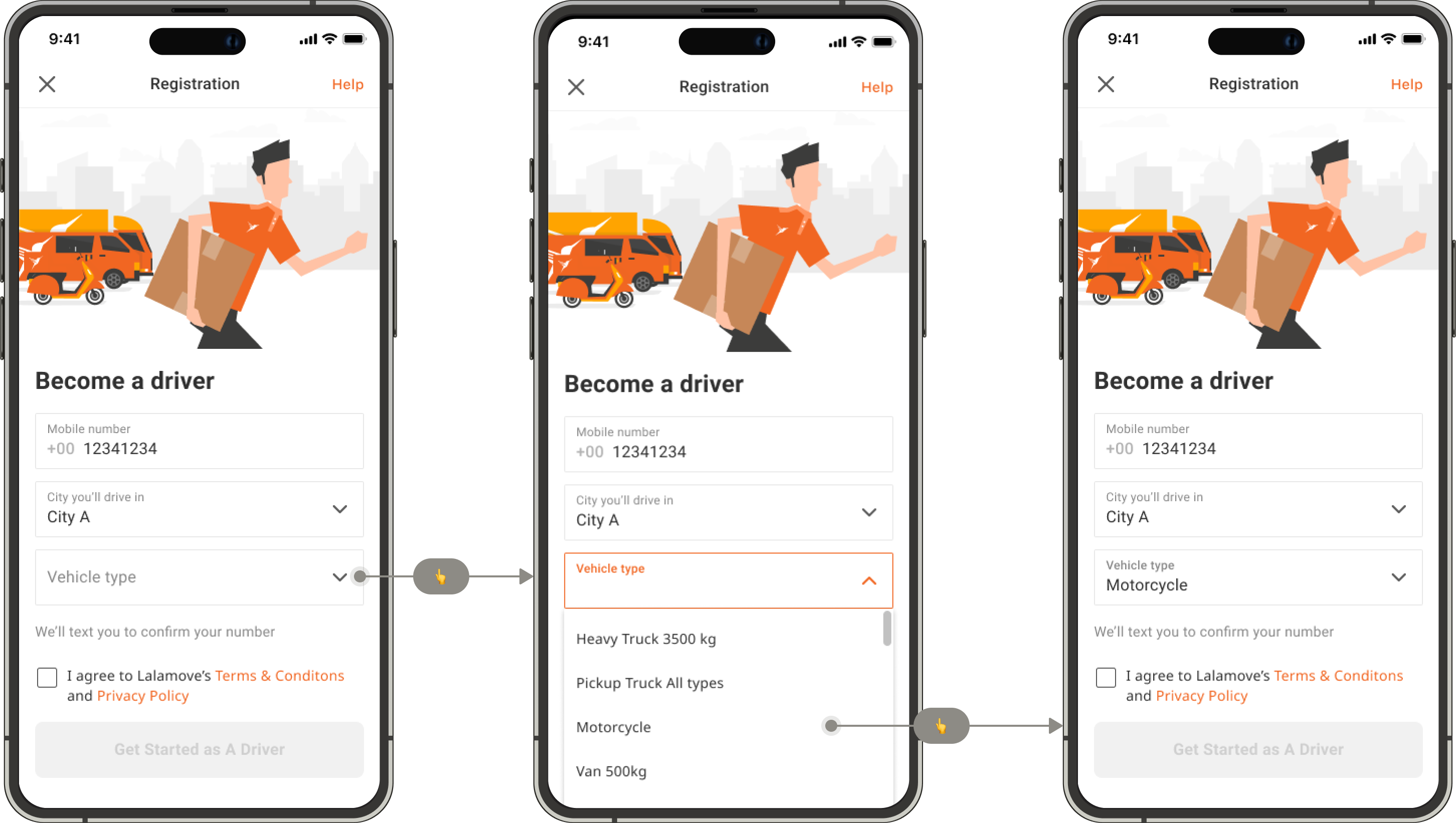
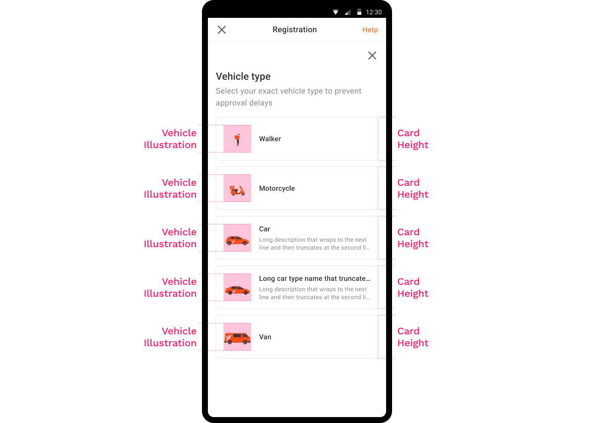
Solution
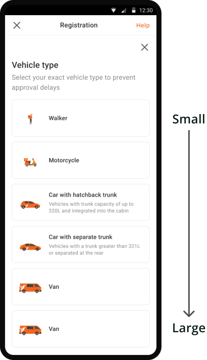
Find the right vehicle easily
Expanding options to full-screen enhances visibility and reduces distractions during selection.
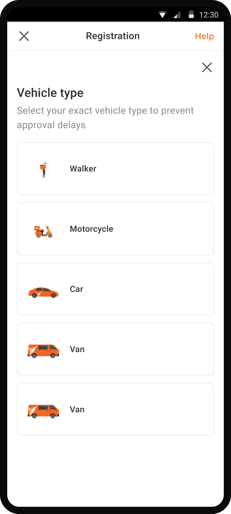
Help drivers understand each option
Adding illustrations and descriptions improves clarity and distinguishes vehicle options, aiding drivers in making informed selections.
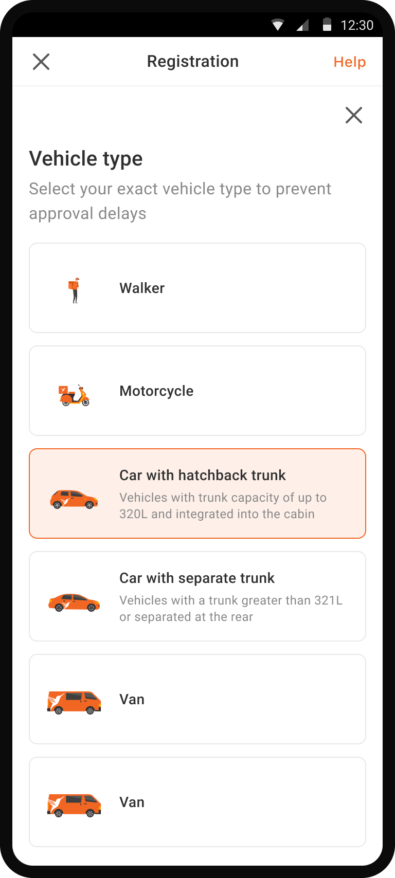
Help drivers understand consequence of choosing the wrong vehicle
Describing consequences helps drivers understand the importance of their selection and avoid random selections.
Theory of Planned Behavior
Design Execution
Exploring different ideas by sketching
I began sketching to visualize and organize my thoughts before I created high-fidelity designs and presented them to the stakeholders.
Click the image to zoom!

Designing high-fidelity to narrow down from the sketch exploration
I designed high-fidelity wireframes to present to the stakeholders.
Idea 1 - Only name changing
✅ No development is necessary
❌ Enhancing option clarity alone may not yield substantial improvements
Idea 2 - Adding a guidance
✅ Keeps a number of steps and page to continue
❌ The guide may not prevent as drivers may ignore after selecting.
❌ Scrolling to view the entire content raises cognitive load for drivers.
 Winner
Idea 3 - Trigger a bottom sheet for the selection
✅ Provides better clarity and visibility for each option by enlarging the options
✅ Drivers focus on selection by providing a dedicated space
❌ Potential risk of decreased conversion rates
Why I chose the idea 3
Idea 3 seemed to be best suited to offer clarity, while I understood the potential risk of adding friction. However, I'd assume the risk is minimal as the selection behavior in the form of a bottom sheet is consistent across mobile apps.
Refining the details
After establishing the high-level design direction, I proceeded to refine the details.
Ordering the vehicle options by size to reduce cognitive load
The existing design lacks logical order in vehicle options, causing difficulty for drivers in locating the right choice.
Cognitive Load Theory
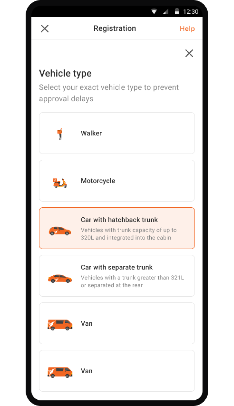
Adding visuals and descriptions to differentiate among vehicle types
To address unclear vehicle selections, I enhanced clarity by adding illustrations and descriptions, signaling drivers to choose carefully.
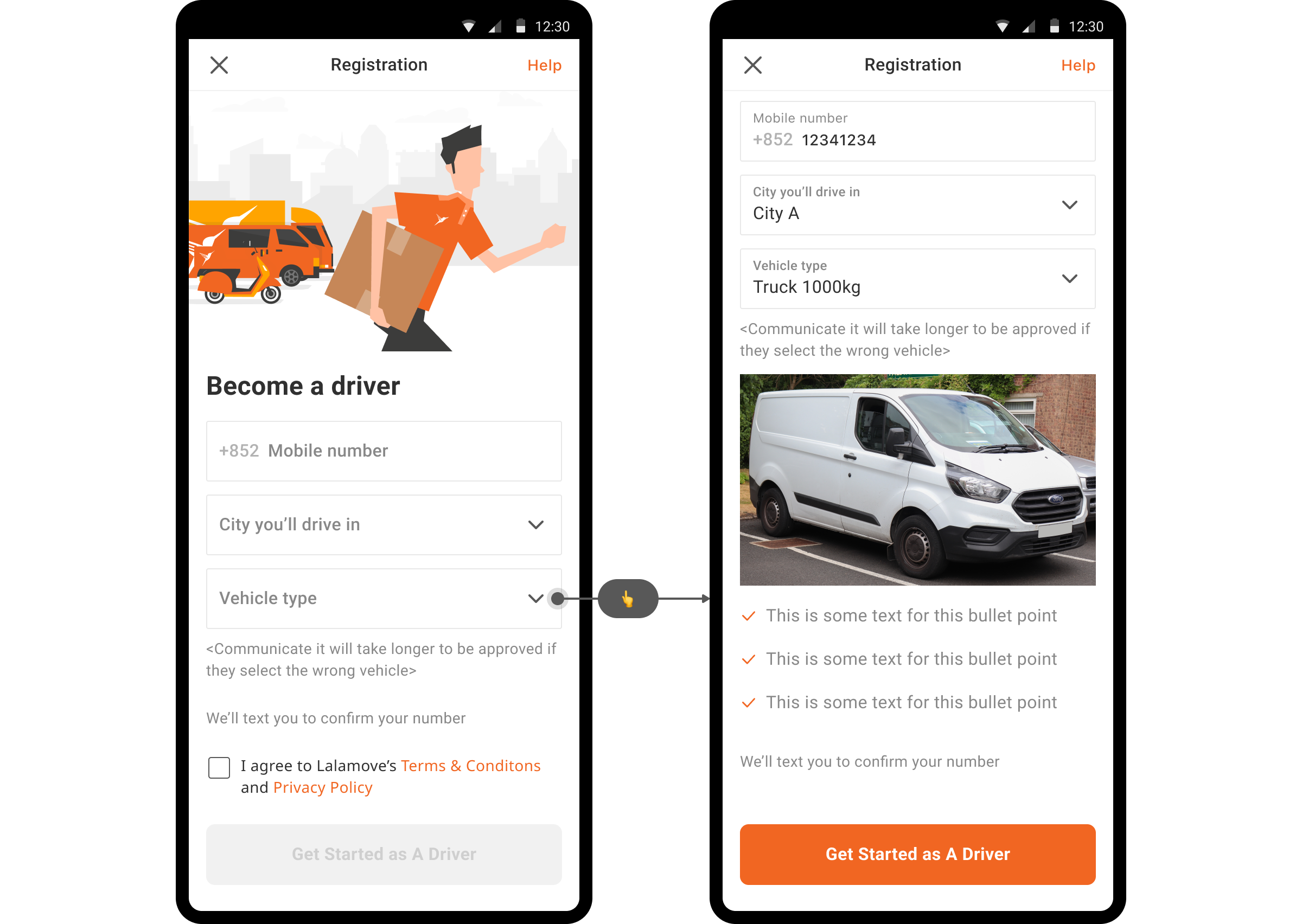
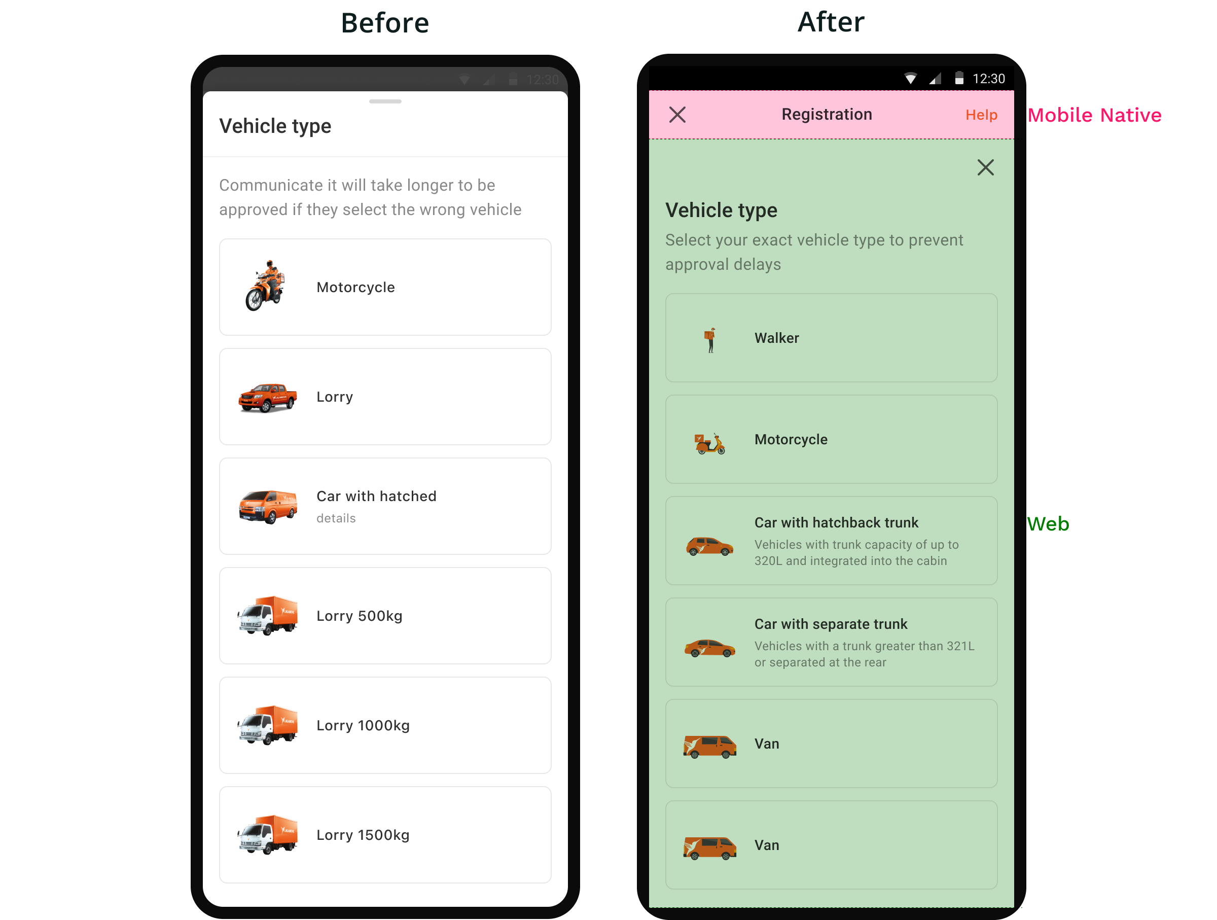
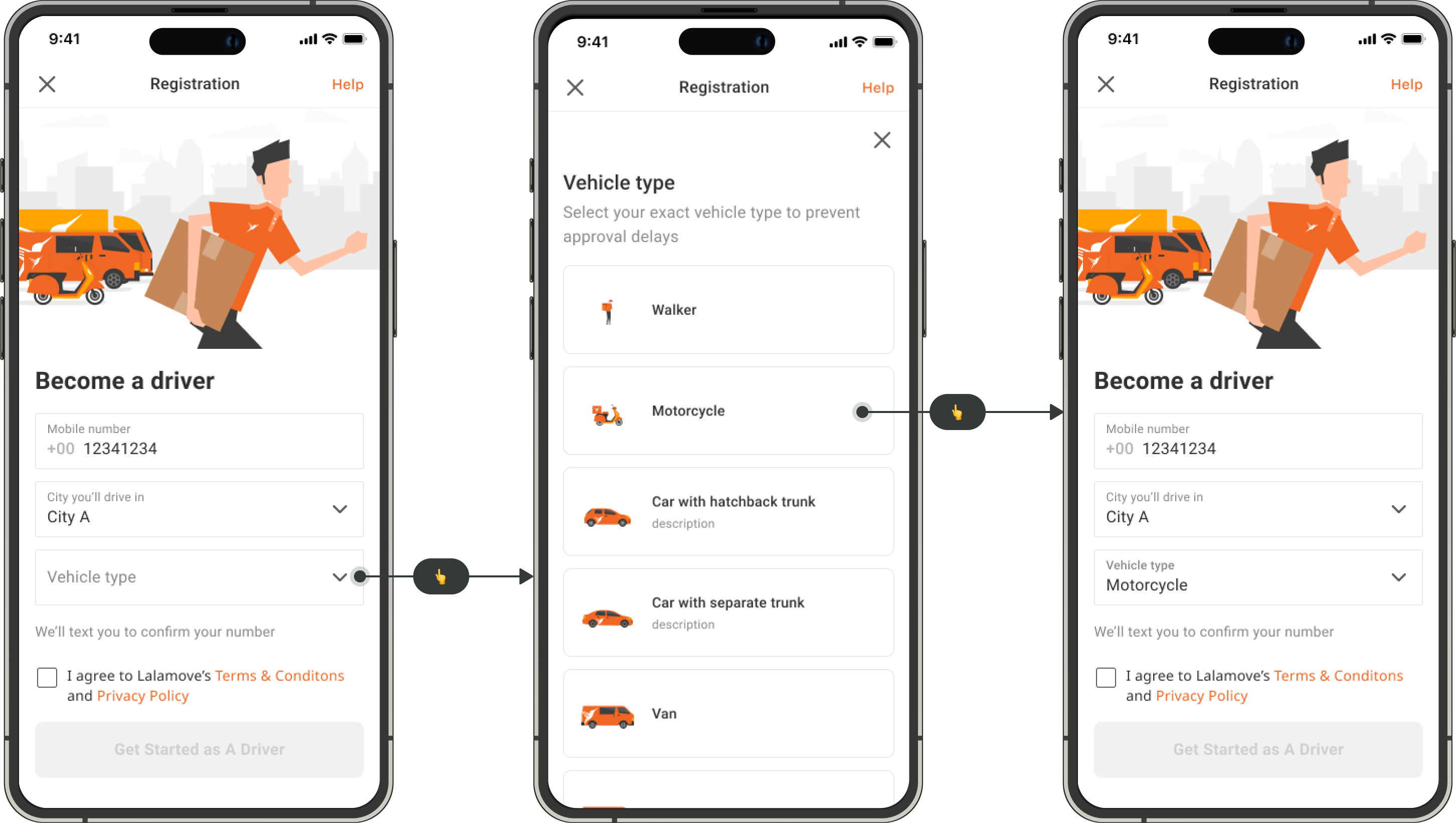
How can I adjust to the web view from the mobile design idea?
After I presented the idea to developers, I got feedback that the page would be built on web. I had to think of a way to adapt this bottom sheet pattern to web view.
I decided to transform it into a full-screen page to keep the intention of helping drivers focus on the selection.
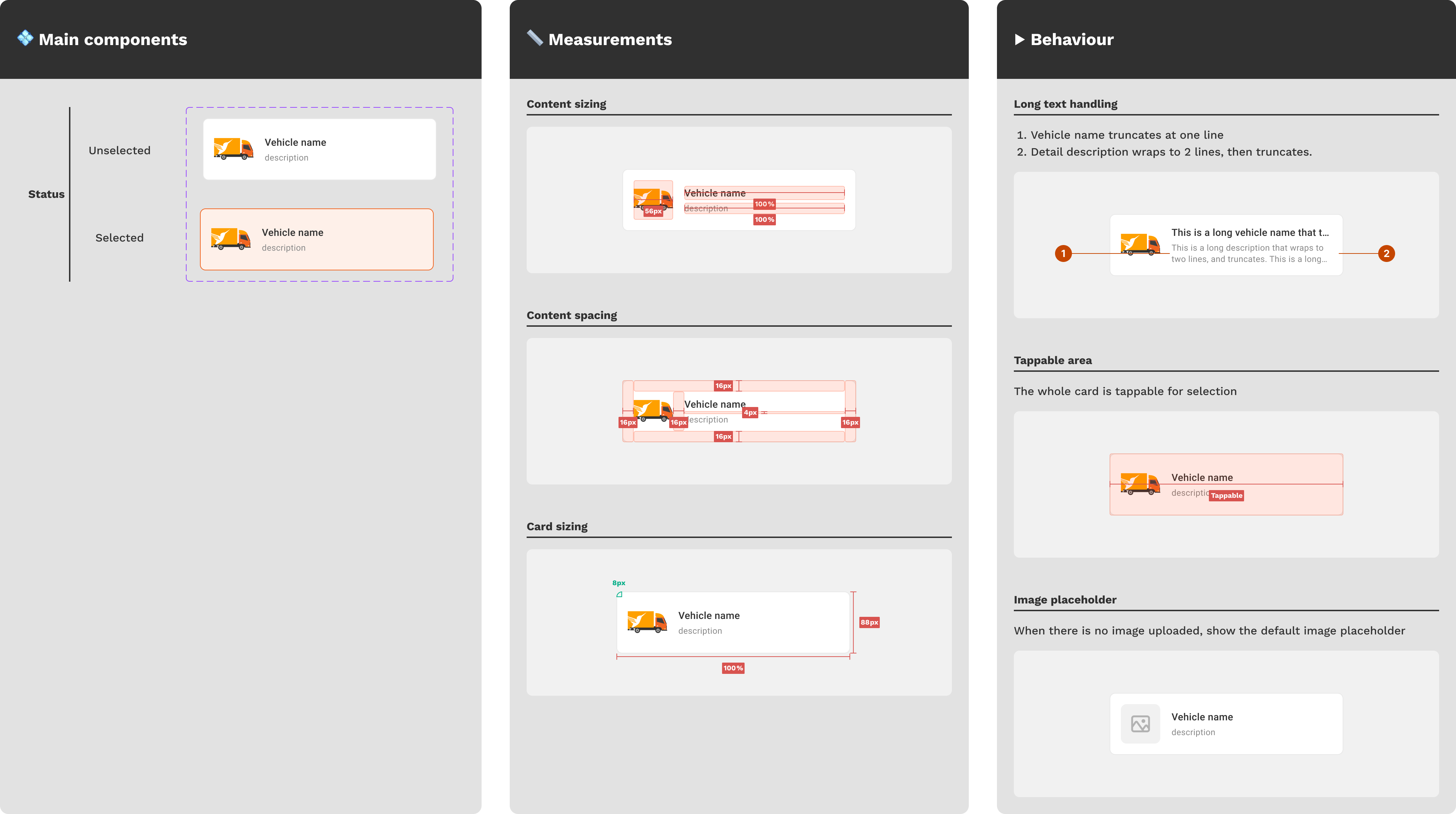
How can I make the option card component more scalable for future use and aligned with similar components in our design library?
For the UI specs, I analyzed current and future use cases of the option card component for user selection, ensuring alignment with an existing card component in our library.
I wanted to avoid a visual hierarchy among options since drivers choose based on ownership. To maintain the visual weight, I truncated long texts to keep the card size equal and advised the local team to limit the description length.
Final design - Clearer vehicle selection
Option card component
I introduced a new pattern for an option card component that can used for other use cases in our design systems.
Click the image to zoom!
Launched incrementally in 5 markets and tracked the data to evaluate the solution's effectiveness
Wrong vehicle selection rate
-30%
Driver conversion rate
+3%
Next steps
We continue to launch the feature in more markets to validate further.
Based on success in 5 markets, we aim to validate the feature in others; however, outcomes may vary due to market-specific issues.
We can research more on how prospective drivers select vehicles.
Local team discussions were helpful but lacked complete driver insights on vehicle selection. Further research can offer a deeper understanding of feature refinement.
Learnings
Despite the limitations, we can still create impactful solutions.
Limited tech resources often prompt quick fixes by adding elements. Assuming navigation was a key concern, I minimized tech costs by leveraging existing elements.
Engaging with the operation team proved to be helpful and impactful.
User feedback is crucial, but time constraints limit in-depth research for minor improvements. Relying on the local team's continuous user interaction yields valuable insights for better solutions.